Quarter Life Crisis
The world according to Sven-S. Porst
« It’s that time of the year again • Main • Telephony FAIL FAIL FAIL »
« It’s that time of the year again • Main • Telephony FAIL FAIL FAIL »
2026 words on iTunes
iTunes 9 was released on 9th of September - haha! - and just as many releases before it it brings a few nice new tweaks as well as a big bunch of more iPod, iTMS crap with next to no benefit to the user. Let me begin with the good things.
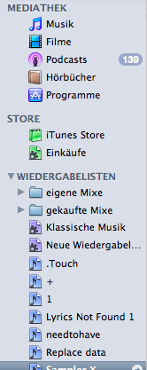 The icons in iTunes’ source list have been refreshed. While they were sufficiently colour coded before, it’s easier to recognise their details now. I suppose that qualifies as a helpful detail.
Looking at the list also highlights that one of the classic shortcomings of iTunes, a shortcoming which Apple happily adopted in many of their other applications as well, remains: I - and likewise you - cannot rearrange playlists in the way I want them. Rather iTunes sorts them by ‘type’ (folder, smart playlist, normal playlist) first and name then. The consequence are names beginning with dots or alephs to get the correct ordering. MS-DOS called from the 1980s and wants its inanity back.
I wasn’t particularly unhappy with iTunes’s classical three column browser for Genres, Artists and Albums. But with more and more music making it into my iTunes library over the years (remember the days when hard drive size was the limit for that?) that list became less and less useful, just as I think the scroll wheel iPods become quite hard to use once you fill the 40GB model. The problem there being that you’d usually want to keep the browser quite small so you can see plenty of songs as well, resulting to a lot of scrolling in the browser which is very inaccurate because even a tiny mouse movement can go past many artists.
 iTunes 9 tries something new here and introduces the “Column Browser” submenu to the “View” menu which lets you use a vertical pane (or several) extending over the full width of the iTunes window to the side rather than above of the song list. While this looks a bit unexpected at first (and perhaps the highlighting and frames could be a bit better/clearer), it does make sense to me. Not only does it accept that iTunes is running wide screen world where vertical screen space is precious, it also makes navigation easier.
Time will have to tell whether this really improves usability, but I’m definitely going to give a single artist column a try.
A good collateral effect of this is that the new customisability of the Browser lets you choose which columns you want to see. The set of columns for the ‘Left’ and ‘Top’ modes differs and unfortunately it seems that columns cannot be rearranged. But this is a first step towards making classical music browsable in iTunes because it will now let you browse by Composer and quickly show you all recordings you have of Bach’s Cello Suites or so. Strangely iTunes doesn’t have a ‘Sort’ field for the ‘Grouping’ of a piece yet, so ‘Das Wohltemperierte Klavier’ cannot be sorted in the ‘W’ section of the alphabet where it should be, just as ‘The Beatles’ live among other ‘B’ artists.

The downside of course being that this highlights the lack, inconsistency and otherwise poor quality of the previously invisible metadata inside your files. It also makes you wonder why, by 2009, nobody made an effort to create sane metadata formats that can distinguish first and last names as well as several names per field and can handle the ‘complicated’ information that may be attached to a file (who composed? when? who played? orchestra? with soloists? with a choir? who conducted? where did the concert or recording take place? what’s the ‘number’ of the piece and in which numbering scheme? … and once I start being anal, I may also want different fields for the recording, mixing/mastering and release years [even if Apple doesn’t sell Beatles rereleases today]). Of course all this can be useful for pop music as well, but those types of metadata seem to be more common in classical music or jazz.
iTunes 9 also introduces a new opinion about the folders in which music should reside on your hard drive. Because of the dozens of strange things the music player manages today, Apple decided that a single folder in which band albums, audio books and podcasts are intermingled does not suffice but that separating those into a subfolder each is neater. That probably makes sense (even though I already sense too deep a nesting of folders when browsing iTunes media). Using the command for organising your library in the Library submenu of the File menu will let you reorganise your library accordingly.
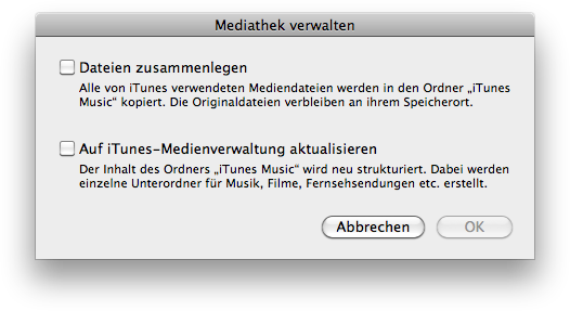
Personally I am hesitant to use that command, though, as I also keep a backup of my music library in Time Machine and Time Machine is famous for being too dumb to recognise identical files after they have been moved. As a consequence, this seemingly ‘simple’ move would cause a massive backup-operation, unnecessarily filling the backup drive or even deleting old backups as a consequence. - The beauty of using an OS, a backup solution and a music player made by the same corporation that makes sure everything works together ‘just right’.
In my personal experience with Time Machine in the past, even manual workarounds for this problem like manually removing the Music folder from the backup before letting iTunes rearrange it, so you only have a single copy of it in backups, can be dangerous as well if you don’t have plenty of spare space on your backup volume. Time Machine does some sort of estimate of the space needed before starting a backup. This includes some mysterious ‘padding’ as seen in the console log. It will delete old backups until enough space for that overestimated number is available (without telling you, naturally) and only then begin the backup it wants to do. As I have often seen said ‘padding’ to be around a third of the actual backup size you can see how you easily run into trouble here when trying to back up a large media library where a third of hundreds of gigabytes quickly add up. Of course this is an idiotic bug, but it surely stopped my enthusiasm for letting Time Machine handle large backup tasks.
 Library Sharing was introduced in iTunes 4. It was a nice feature that was implemented with sufficient care for detail to allow live updates of the library status while a connection is already open and so on. Subsequently, Apple decided to put a lot of engineering resources into making it worse and worse because they considered getting in bed with the music industry more important than having a good feature. Hence, the protocol stopped working around the world, it stopped working with an arbitrary number of clients and it stopped having any hint of interoperability once iTunes insisted on encryption.
iTunes 9 brings a new variant of Library Sharing called Home Sharing which lets you set up a bunch of additional copies of itunes as yours and it ‘allows’ you more powerful access to those, offering (not outrightly refusing would be the more adequate word) to copy files back and forth. This may be an advance of the sorry state of previous versions, but ultimately it is lame and useless.
Setting up the feature starts the world of suck: it requires you to sign up both computers to iTMS. Now what the hell does iTMS have to do with my private home sharing? Why should I even ‘need’ an account there? Why should I need to ‘register’ with them. The ‘5 machines’ restriction imposed by iTMS is crap enough and now they even encourage people to sign up more machines than necessary for that.
I also fail to see how this is going to work once more than a single person (e.g. a family or a bunch of people living together) is involved. As soon as a few of them have have their own or no iTMS account, the whole illusion of effortlessly sharing across the home becomes a sick joke, another instance of lawyers and cash standing in the way of a good experience.
Actual problems I am seeing with iTunes Library Sharing and which I keep hearing about are very different anyway. A big one is that many people seem to like the idea of setting up a litte ‘home media’ thing with a big hard drive that stores all their music. It may also offer iTunes Library Sharing for convenient access. Once the Library is sufficiently large, simply loading it can take ages. Some cacheing strategy would have made the experience a lot better there.
Another feature that would be useful: being able to sync your iPod with music from a shared library without needing to copy it to your local one first. Same for burning CDs of course. And I could go on and on how a good media management software should really attempty to unify all the music on your network and present it for effortless playback everywhere. But iTunes’s implementation and Apple’s closed standards arrogance suggests that I need to find a different software first (which, due to Apple’s music player monopology on the Mac, means finding a new OS first).
The general look of iTunes 9’s windows has been revamped as well. It is a bit lighter than previous versions and comes with a lot of rather unsubtle ‘reflection’ effects. ‘Naturally’ iTunes’ windows keep looking different from other Mac windows. Not much so, but still noticeably. Would using a standard window be so friggin’ hard? One advantage of the new look is that is seems to include fewer long-stretched gradients which result in ugly dithering artifacts on my MacBook’s crappy display.
It seems like they managed to save some vertical space in the window’s header by leaving out the label of the search field and tightening the spacing in the display. They also ‘redesigned’ sliding elements, by letting the left and right side of the volume slider have different colours. I have no clue how that’s supposed to make the slider easier to understand or handle. Furthermore the light/dark scheme used there is the opposite of that used by the playback progress indicator right next to it.

A further change in general behaviour seems to be that iTunes now opens its cover art window if you happen to click on the cover art area in the main window when wanting to bring the main window to the front. Wrong and rather annoying if you ask me.
The iTunes Music Store was shit before iTunes 9, and it still remains so. They made it look cleaner, more shiny, and more annoyingly animated now. They also tried to hide many parts of the UI by default requiring you to hover around a lot before redisplaying them. Playback controls for testing tracks seem awkward as well, the store handles an iTunes window of my preferred size even worse than the old one and menus inside the store seem to appear at inconsistent/random/useless locations. The shopping cart was renamed to Wishlist (pretty much impossible to find out) with the unpleasant side effect that you can only ‘buy now’ in this version. I dislike ‘buy now’ stuff, I like reconsideration. But apparently being pushy makes more money.

In general I think the whole approach of iTMS is horrible. It’s the same reason why I hate noisy supermarkets full of pointers to their offers. I am not coming to learn what the interns at iTMS, the coked up managers at music companies or the unwashed masses are excited about (mostly sluts it seems, with a few reiussues by dead bands thrown in). I usually come to use the search field. So a Google-style start page and no-nonsense search result pages would seem more useful to me.
iTMS still lacks standard controls, but they did refine them a bit with this release. Most notably the little horizontably scrollable lists of albums they display now seem to be loaded in one go and will scroll smoothly, even using the scroll wheel. A huge improvement over the previous behaviour.

One of the most annoying things about the iTMS for me is that now you cannot play and skip tracks with the keyboard. This won’t definitely encourage me to use it more than before. Also, the play, next, prev buttons lack of tooltips, but I don’t know how far this dates back.
