F11
2766 words
Right, MacOS X.3, aka Panther, is the topic du jour and I don't want to miss that one. Most new features have been presented and discussed at length and many of us Mac people have been itchy of anticipation. If you missed the whole buzz, read Apple's propaganda, how it's favourably reflected in the Guardian, its future discussion in a dedicated weblog or Mark Pilgrim's roundup with nice screenshots. Those reflect the majority of the new features, meaning I can dig in and start commenting right away.
Drama
I wasn't too sure that I'll actually have my copy of X.3 today. It was shipped two days ago from Ireland, as is everything for Apple Europe, and that should take a few days. The next obstacle was that Apple tend to use parcel services rather than the proper mail service. Parcel services tend to be particularly daft when it comes to deliver correctly addressed things. Also, they tend to come at strange times and if you're not in then, you'll have to wait until their next round – which this time with the weekend in between may have only been on monday. So when Steffen IMed me this morning that his copy had arrived, I couldn't resist to phone my flat ... and learned that mine had arrived as well and it was ok that they accepted the delivery for me. Sheer Drama.
Unpacking
Knowing that there's a new toy at home, I went home early to try it out. While I think it's superfluous, I must say the packaging – a nice black box with an embossed silver X on it – is nice. It contained some paper, the three installation CDs and the developer tools CD. I went for the update install, because that's how it's done with Macs. No problems there, except that it took ages. I easily borrowed washing powder, put my laundry into the machines, cleaned my windows and read some sections of Die Zeit before it finished. Once it had finished, everything was good, though.
Speed
The good news first: While it may not actually be faster than it was before, it definitely feels faster. Most notably menus start deserving the name 'drop down' menus again. While they're perhaps not quite as fast as in OS 9 yet, the speed of menus on the Mac stopped being embarrassing today. I also unscientifically feel slight increases in application launch times and in general responsiveness. This doesn't sound like much but it's actually a big deal as those split seconds you waste waiting for your computer to respond are actually deducted hundredfold from your life. So, yay we've got speed.
Exposé
And there's Exposé. It's fun and it's much smoother on my old TiBook sans Quartz Extreme that I thought it would be. Cool. I'm not quite sure that it will actually be useful for anything but moving my windows off screen to see where to the Finder has displaced my desktop icons this time – but I quite hope it will be. For the time being, I'll happily invoke it without any proper reason to do so just because it's pretty. I am starting to be an addict and I offer to run a self-help group for Exposé addicts. It will be called F11, just drop me a note if you want to join.
 Playing around with Exposé, I noticed a few quirks: Exposé is actually quite good about updating windows while it's on: Window content remains live – you can watch different apps complete their tasks and switch to the one that finishes first, for example. That's quite good. However, the window title shown by Exposé isn't live as is the rectangle used to highlight the window. If the window's size and title change while Exposé is on, it will still be highlighted using the original name and size. This can be seen in the screenshot where I invoked Exposé while the Monitors control panel was loading.
 Another quirk, is quite strange as well. The way windows as shuffled around by Exposé doesn't seem to depend on the number, size and position of windows but also on the frontmost application. Just compare these two screenshots of Exposé coming from exactly the same arrangement of windows along the x and y axes – the only difference being that Safari was the frontmost application in the one situation and NetNewsWire was the other.
 While this non-predictable arrangement may be a bit irritating in principle, I don't think it does a lot of harm. Other things, like the handling of small windows or the sheets sliding right onto the screen out ouf nowhere while Exposé is active seem more critical to me. Sometimes I found it hard to locate my minimised iTunes controller. Perhaps smaller windows shouldn't be reduced in size as much as are the larger windows. Anyway, this is the first incarnation of Exposé and there may be improvements to come in the future. It's quite cool for the time being.
Btw, pressing F9 and F10 alternately is very nice and soothing to look at as well...
Preview
The extra speed is very welcome, Exposé is way cool, but the new version of Preview is probably the feature of X.3 that may be worth the €100 by itself. I work with PDF files a lot, so handling them efficiently is important. When I saw Steve Jobs demo I was enthusiastic but still a bit sceptic – how will the speed he demoed scale from a PowerMac G5 to a two year old Powerbook?Rather well I must say. Files open quickly. Searching is quite fast – about a minute for the first search of a 550 page document yielding 1500 results. This seems to involve some indexing as the second search will only take 2 seconds. They even seem to have gotten the load balancing right – I can navigate through the partial search results while the search is still running, making the long initial search time tolerable.
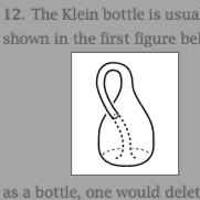 I can select text and copy it. I can crop bitmap images. Best of all, I can even select and copy vector graphics from PDF files. I could, for example nick this nice vector drawing of a Klein bottle from Allan Hatcher's excellent book on algebraic topology in its full vector graphics glory.
And note the nice selection tool they included – complete with fading out of the irrelevant bits like Photoshop's crop tool, but easier to use as you don't have to aim for 'handles' but the pointer will always reflect that it will manipulate the corner of the selection closest to itself by taking the shape of the corner in question. [This can't be seen in the screen shot.]
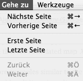 Not everything is good, though. Just look at those keyboard equivalents in the Go menu. Inconsistent across languages and applications and the German ones are impossible to use with non-German keyboards.
Very nice – and good bye to Acrobat Reader or its offspring.
Not everything is good, though. Just look at those keyboard equivalents in the Go menu. Inconsistent across languages and applications and the German ones are impossible to use with non-German keyboards.
Very nice – and good bye to Acrobat Reader or its offspring.
Mouse
Is it just me, or does the mouse move quicker at the same settings than it did before the update?

Address Book
The Address Book saw improvements as well. The most stated are the printing capabilities. I am disappointed by those as they won't let me print in the way I want my address list printed – all addresses in a tiny font size and long lines on a single A4 page. I hope people will come up with ways to extend this so I don't have to do it myself. What's nice about the update is that you can finally set the address book up to automatically display the birthday field, as needed by GeburtstagsChecker. It also allows you to edit a person's nickname now – a bit of information stupidly still not used by the new version of Mail – so I have to continue entering my parents' full names to send them a message.You can also associate a person to another person and specify the relation between them – but that feature is somewhat half-assed. No drag and drop, not automatic recognition etc. A nice idea, but I'm tired of having to wait for yet the next update for things to actually work.
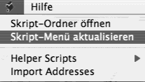 Other strange things: There's still no way to set a preferred e-mail address for a person. There's a field for the maiden name. Seeing that not only women change their names these days when marrying, this looks like a word from the past. Particularly in these politically correct days. And take a look at that script menu. This must be a very bad joke – an 'update script menu' item. Do this automatically, stupid computer, don't bother me.
Did you ever notice that the search field in the address book and that in iTunes don't work in the same way? In iTunes, every playlist has its own search term, in the address book one term is shared and automatically applied to whatever distribution list you select next.
Once that was sorted, things were better, a bit faster in particular. MailPictures stopped working - but Mail automatically displays photos from the address book now, so that's not a big deal. GPG Mail stopped working as well which is worse. The date column displays times respecting my time format now – the 24h clock in particular. About time. However, when it displays the date only (i.e. no time), it won't use relative dates.
 Another nice thing is that Mail seems to deal more gracefully with network disconnections now. No more annoying dialogues. Instead there's a little symbol next to each mailbox to indicate it's been taken offline. Just don't click it as Mail will then try to connect to all accounts, asking for passwords. Which is bad if you have dummy accounts set up – setting up an extra account seems to be the only way to have different 'From' addresses.
Printing
Apart from forgetting my preferred paper size and setting it to 'Letter' for no good reason, printing seems fine. Yummy desktop printers. The German localisation of the print dialogue when using PDF Services still sucks. Even more so, now that there is an extra 'Fax…' item in it. This is a known problem even.
Calculator
A mere two and a half years after its début, the OSX calculator can eventually accept input at the speed that I choose to enter it at. Steve said that hell froze over the other day – anything is possible.
Safari
Safari 100 is included. Tabs are called 'Tabs' again in German. However, now they call bookmark folders 'Lesezeichen Ordner' in one place and 'Sammlung' in another. Safari is installed directly into the applications folder, rather than where the previous version resided, leaving you with two versions. Still no filter field for bookmarks. Still no undo in form fields. The annoying downloads window still exists and gets into your way.And there are even more changed keyboard equivalents here. Why do you have keyboard equivalents if they're changed all the time and inconsistent across applications. E.g. 'Toggle status bar' was a semi-logical Command-Option-S and now is a finger-breaking Command-Option-/, where / is Shift-7 on a German keyboard just to have the old one for Snapback. Showing the bookmarks is now Command-Option-B, where Command-B does nothing.
SMB
Windows networking has improved. I can now see all the machines in our network. I'm not sure whether OSX finds out the necessary WINS address itself or it uses the one I entered ages ago. But besides that it still sucks. Seeing 'workgroups' and computers takes a while. All Apple seem to do there is runningnmblookup and smbclient just as any Linux tool would. Apple just does it less quickly and makes you click an extra button before you can access one of those servers.
Oh and once you managed to mount an SMB volume things still suck like they used to. The system will lock up and rotate its beach ball when applications try to access files. Unfortunately Nicholas was a bit too optimistic about this. It took me less than an hour of fiddling with SMB volumes before I had to restart because everything kept locking up. Bum.
![]()
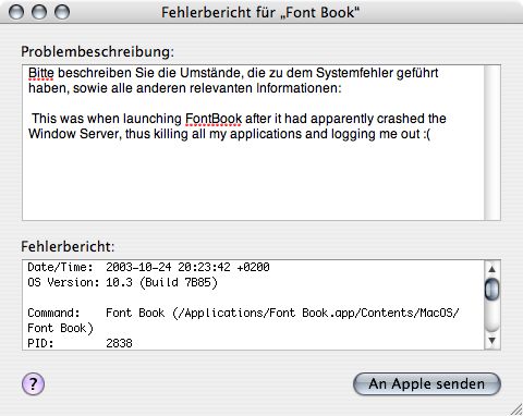
Font Book
Finally there is a tool to deactivate and manage fonts. And to preview them almost as easily as you would have done in System 7. And to crash the Window Server, thereby killing all my applications. And to be pixel-imperfectly localised. Yet another application that's all good intentions but should have had a few more spins around the beta testers before being unleashed on the public. And why exactly it is considered an 'Application' rather than just a 'Utility' is beyond me.
Crashes
Application crashes are now accompanied by a window that lets you send the crash log with comments to Apple. I hope we won't see them too frequently. That would be very annoying. Also – why is the 'Send' button a pulsing default button when there's no way to invoke it using the enter or return keys?Now that I've arrived at the topic of crashes, the ugly side of X.3 moves into focus. As in its predecessors it is mostly concentrated in
The Finder
– or what's called Finder these days. The nice thing about this update is that you have icons zooming towards you when double clicking a file. Eye candy that I am not sure of how we made do without it for the past years. Everything else is as bad as it was before: My hard drive icons constantly moving on my desktop, bad localisation, no localised folder names when the Finder displays complete file names, no more support for icons of different sizes within the same folder, the Finder locking when connecting to a server, no smooth scrolling, confusing hiding of scroll bars when displaying column view in metal mode, not all network volumes are displayed in that side bar thing. In fact, sometimes it's hard to tell which network volumes are in fact mounted wihtout usingmount. No Services menu in that 'Action' menu.
And so on. The new metal window mode is just new window dressing. All the old bugs remain. No preview for PDF files in icon mode. No preview for icon files ever – the revenge of Carbon I suppose. No double clicking preview images. And new bugs are there: For some reason Acrobat Reader is now displayed Acrobat Reader 5.1.app
, that's right including the app
part.
You get the idea. Should anyone actually be interested in this, then I can elaborate and provide screen shots. In all the 'all new' Finder is still a stinking pile. It's not that any of the problems I mention here is particularly non-obvious.
Other
Other things:OK, I'll go press F11 for a few hours now. Bliss.
