Gradient
563 words on Mac OS X
Picking up where I left yesterday I want to give a somewhat trivial example for using Core Image. I think this example highlights two main things about Core Image: On the one hand it is both amazingly powerful yet quite easy to use – on the other hand, understanding all the details correctly may turn out to be harder than expected. At least for me.
Recently the discussion about MacBooks using displays which are only capable of displaying 18bits worth of different colours came up. A lot of incompetent blather could be read about this on the internets with Apple’s ‘hush-hush’ strategy working great because nobody actually knew what they were talking about. Of course I checked my (old) MacBook and it supposedly had a display with just 18bits as well. Yet, I never noticed any bad gradients and the example images I looked at looked just fine and didn’t present any of the supposed chunky steps. Lucky me, but puzzling nonetheless. As the new MacBook arrived I did a similar check on that one and, indeed, its screen is worse in terms of colour resolution with a few steps (but nowhere as many as suggested by the ‘example’ images I saw) being visible in gradiends. Yay for progress!
It is unclear how to get an actual result on this. An example of how not to do it would be this site which gives us a test image with gradients to judge whether or not our screens give us a smooth display or not. My idea about such a gradient would be that each of its columns contains pixels of the same colour and the colour changes horizontally to give the full gradient. However, looking at the image closely reveals that it is nowhere like that but there are really strange shapes in it. At 500% size with enhanced contrast a small bit from that gradient looks like this:
This probably doesn’t make the image file in question the best to judge how gradients are displayed. And because of that I wanted to make my own gradient. To have precise numerical control about it I thought I’d just use a simple Core Image filter that increases the green component of a pixel with its x co-ordinate. Rendering this on an area with a width of 256 pixels should give the desired result. The image kernel looks like this:
kernel vec4 gradient(sampler image)
{
   return vec4(0.0, samplerCoord(image).x/256.0, 0.0, 1.0);
}
And to put it on screen I used QuartzComposer with this simple composition:
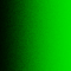
And the result I get looks like this:
And it’s a gradient, all right. With nice vertical lines as I wanted them. So that part worked. However, the gradient is in no way the one I wanted. Its darkest vertical line has a green value of 8/255 and not the 1/255 I would have expected. The one following it has a green value of 15/255. And thus, to fill things up properly, some of these lines aren’t just of single pixel width as expected but wider. Which suggests that I haven’t understood this well enough yet (colour management? a gamma curve? some floating point issue?) to get the results I want.
Any hints? Pointers to documentation?
additional post related to this has been added. It discusses – no joke – the difficulty of making screenshots of the gradients I created.


