1486 words
on
Patches
,
Software
 Safari 4 was released last week. It’s unspectacular from the point of view of a web user and brings a lot of improved techno-wanker stuff beneath the hood. That’s probably a good thing as someone has to take the first step and Safari and other non-IE browsers seem to have enough velocity these days to help driving the development of web browsers and even dragging the Microsoft’s Internet Explorer along.
Bling
The more critical points about Safari 4 are the changes to its user interface though. Some of them, like ‘Top Sites’ are vacuous pieces of crap (enquire within to make me argue that it’s visual overload, much less effective than typing the first letter of the address and may waste your time by reminding you of the existence of websites you shouldn’t visit so often), but unlike many other types of crap Apple introduced in the past years, these can be easily and turned off and ignored without any problem.
Cover Flow and lost opportunities
The same uselessness statement could me made about Cover Flow bookmarks, I suppose, but to be honest I hardly ever use my bookmarks at all, so to me it seems mainly a waste of effort (and judging from what I heard others say, a rather unreliable one at that as Safari doesn’t seem to be good at actually fetching those images. Personally I also consider that feature a missed opportunity. Not only did Apple decide to litter our hard drives with hundreds of megabytes of web page screenshots (opening the folder of which may be a good way to visualise the privacy implications of web bugs - particularly Google), they also missed out on the opportunity to create a good solution for this that offers search and offline access as well.
To me the current implementation of Safari seems ridiculous. For each page you visit it stores a reference in your browsing history, it saves a file with the page’s text for Spotlight searches and it saves a screenshot of the page for its Cover Flow bookmarks. Yet, there seems to be no way to actually look at the screenshots Safari stores for you. They are not displayed by Quick Look when invoked on browsing history items and they are neither used to give you an impression of one of those history items when you are offline. To me, saving a web archive with the actual page in it (plus a screenshot, possibly, for performance) would seem much more logical. And it would make those situations when you discover a page you visited in a Spotlight search while you don’t have internet access much less frustrating.
Tabs
Another big debate among browser users was Apple’s re-location of the tab bar into the window’s title bar which existed in some beta versions of Safari 4. While I could appreciate the space savings of that, I thought it was more irritating than useful in the end. Simply because it made the window’s title bar look extremely busy and made things hard to click. In addition, that idea also ruined other subtle display methods in Safari: The unique lock icon location for encrypted sites and the full window width page title. Without the latter it’s quite hard to see the page’s name at a glance.
Surprisingly Apple listened to the loads of the feedback they must have received on this issue and the released version of the browser come with traditional style tabs. Those aren’t perfect either, but apparently they’re the best you can do when working with the ‘tab’ metaphor. In particular, they still suffer from horizontal overflow problems, as tabs to everywhere. And Apple’s insistence on only giving you an overflow chevron with no way to actually move between the tabs doesn’t make that any better. In fact, they added some fancy background colouring to the menu coming out of the overflow chevron, presumably to give you a better idea about the context you’re looking at. But I am not really sure it helps me figure out anything.
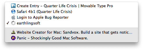
The following two screenshots are an example of that. I opened six tabs in a narrow Safari window which could only fit four of them in. In the beginning, with the fourth tab selected, it looked like this:

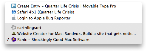
This makes sense to me, assuming that the light colour indicates the visible tabs and the dark colour indicates the hidden tabs. Then I paniced and switched to the last tab:

Now, with the same window width and tab arrangement, seeing three of both the light and the dark items suggests that my initial idea about the meaning of the colours was wrong. I guess I’ll just have to avoid looking at this. Tabs aren’t good for you anyway.
Progress
Another contentious issue was that of the progress indicator. Safari used to have a progress indicator which coloured in the address field according to the page’s progress at being loaded. While a progress indicator that gives quantitative information may be extremely problematic on a conceptual level for loading web pages - you have to display some progress immediately after the request is sent to let the user know something is happening but you have no clue at that stage how long it will take to complete everything - I think that Safari used to fake it reasonably well.
Nobody wants to read precise information from the progress indicator. Usually people just want to see that (a) their request is being processed and that (b) some progress is happening. That is, you want a bit of the progress bar to appear as soon as a click is made and then you wa old nt the progress bar to move at a reasonable speed as long as data are coming in. That way a stalled progress indicator may give you a hint that something isn’t working properly and that a reload may be in order. Particularly in low-bandwidth situations, which web sites and browsers don’t seem to be particularly good with, this is a useful feature.
Apple decided to remove the progress indicator in the betas, replacing it by a tiny spinning progress indicator at the very right hand side of the address bar in beta versions. This was very irritating as the visual impact of that tiny graphic was so low that you always had to consciously look at that tiny bit of screen space to see whether or not the progress indicator appeared. Definitely a change for worse, big enough to penetrate Apple’s bug reporters (perhaps people at Apple are even using Safari themselves…).
Their ‘solution’ to the problem was to not just display the progress indicator but provide an easily visible dark background around it which you’ll immediately notice without having to make an effort to look for it. That certainly solves the biggest problem with the new progress indicator seen in the betas. The other problem, however, of seeing whether there is actual progress in the file transfers or whether they have stalled, remains.
I’d certainly like to read the reasoning that went into putting engineering resources into making the progress indicator worse than it was before. Seems illogical to me, particularly as Apple missed out on what looks like the only potential advantage of an indeterminate progress indicator to me: The ability to let it spin when further resources are loaded after the page finished loading, like many of those fancy web 2 pages like to do.
Reload button
Another problem with Safari 4 is that Apple moved the Reload button to the right hand side of the address bar. Web browsers were born with the reload button at the left hand side of the window. More importantly, they were born with the Reload button close to the Back and Forward buttons, which not only makes sense but also keeps distances short when navigating with the mouse. Internet Explorer 7 broke that tradition and its wrongly placed Reload buttons remains the second most annoying thing about it (the first item in the list, naturally, being the rendering mistakes which make me need the reload button and non-trivially test in that browser in the first place).
Safari is keen to follow in Internet Explorer 7’s steps in this respect and moves its combined Reload and Stop button far away from the other navigation buttons. That irriates the hell out of me - and apparently a few other people as well. As there seems to be no point in holding one’s breath (and Apple’s software regime on the Mac hasn’t reached iPhone level fascism yet), a little bit of clicking yielded this:

It’s not as good as the Safari 3 original as it doesn’t reflect the state change from Stop to Reload but it may be a reasonable approximation until somebody discovers a better fix. You can grab a copy of the files here and use them at your own risk.
June 14, 2009, 0:34
Tagged as
hack, patch, safari.
So, is disimprovement now the official translation of verschlimmbesserung?
June 14, 2009, 8:08
Thank you for this interesting read. Personally I’m not very impressed with the UI changes Apple has made in Safari 4, especially the way they implemented tab overflowing really annoys me, as I usually have a lot of them open throughout the day.
Thanks for pointing at the “Safari 4 Reload Fix”, that should save me some valuable time.
Greetings
June 14, 2009, 10:20
For years now, I’ve positioned my return button on the right side of the address bar. So the new position works for me. I also kept the add bookmark button on the right side, so the new position is a departure for me; but I don’t find it a problem.
Regarding the spinning progress indicator, it does provide less information than a bar progress indicator. The only time I can see it would make any difference is when a page has stalled. Apple can readily fix this by changing the speed at which the indicator spins, and, come to think of it, this should have been implemented long ago to give some idea of the relative speed a task is being performed.
Regarding the tabbed interface, it amazed me at how many people liked the tabs in the title bar. I found it hideous and an abject rejection of Apple HIG. A person who is concerned about those 20 pixels or so can hide the bookmarks bar to get much of the same effect. For that matter, Apple should allow you to hide the tab bar as well. You can always navigate the tabs with keystrokes and can readily tell which tab you are viewing by content or the address bar. This makes sense in that you view only one tab at a time anyhow, as if it were a dedicated window.
June 14, 2009, 20:56
Geez. Try proofreading. Paniced? Wand for want?
June 14, 2009, 21:54
@arw: Where did you keep your Back/Forward buttons, if I may ask. To me those buttons belong together. And, typically, they are at the left hand side of the window.
@JJ: Thanks for pointing out the ‘Wand’ typo; corrected.
June 14, 2009, 22:37
Whatever. It’s blazing fast.
June 15, 2009, 1:35
Excellent analysis of the Safari release and past betas. You identified the problem with all new browser releases. The designers feel a need for a “WOW” factor more than a better working factor. While I understand Safari 4 is faster than 3 the visual overload and file overload runs counterproductive to an effective, streamlined tool Safari could be.
The majority favor software that works well without the glitter. If software developers made product that just worked well with new versions that just worked better, and leaving the extras, modifications and glitter as free downloadable addons our hard drives would be happier and I would also thank them for the simplicity of their work.
June 15, 2009, 3:03
Wow. You hit everything I dislike about the new Safari. Especially the reload being moved to the right. It is driving me nuts. I am totally confused by the right end of the tabs. The double arrow makes no sense. Previously it would show the tabs open, but for which there is no room. Now it gives a list of all the tabs that are open and which you can already see. Then down in the gray part of the list are the tabs you opened, but which do not show followed by a selection of your previous browsing. Just bizarre. Hopefully someone will find some instructions to restore the movable reload/stop buttons, the blue progress bar and the previous tab behavior which was just find. I would also like to be able to turn off top sites everytime I get a spinning beach ball waiting for it to load before I can use the browser.
June 15, 2009, 4:25
Personally what I hate the most in the release version is CoverFlow bookmarks. It takes up far too much room and even if you push it all the way to the top I assume it’s still needlessly using resources in the background. Unlike you I do use Bookmarks to organize my browsing and would love to return to the CoverFlow-free previous incarnations of Safari. No way I could find to completely turn this off.
June 15, 2009, 16:38
@ncm:
I can see how the Cover Flow is annoying if you use bookmarks beyond the bookmarks bar, but as you point out it can be reasonably minimised. Cover Flow does use the saved screenshots of pages, but as those are created anyway, I’m not sure that Cover Flow itself creates significant overhead. If you could turn off Preview creation that might reduce resource usage, but I wonder whether it will improve performance.
It seems like you can effectively prevent the creation of preview images by doing something like chmod 500 ~/Library/Caches/com.apple.Safari/Webpage\ Previews but I didn’t have the impression that this improved performance (it just litters up your console log, so I rate doing that mainly a bad idea).
June 15, 2009, 17:20
I’m convinced the progress indicator is merely a way to enhance the perception that Safari is loading pages quickly. No, I’m not into conspiracy theories, but since there’s no benefit to the user from this design, it’s all I’ve been able to think of as a basis for this design.
To me, the most egregious design decision is the long-standing failure to implement a user-friendly design for adding bookmarks. Using the Add Bookmark command when viewing a page reveals a tremendously unhelpful pop-up menu. Users like myself who have lots of bookmarks in organized folders are immediately struck by how poor this design is for adding a bookmark. If my screen were large enough to show the entire pop-up menu, it would be more than 60 inches (153 cm) tall.
Worse, in Safari there is already a perfect design in place, but it’s just not applied to the interface for adding bookmarks. Open the Safari Preferences window. Under the General tab, use New Windows Open With to select the option for Choose Tabs Folder. The dialog box that opens would be perfect for adding bookmarks instead of the muddled method currently available. I submitted feedback on this during the beta, but apparently to no avail.
And here’s an additional point on the Apple use and implementation of bookmarks. The prioritization of one’s browsing history over bookmarks with the URL autocomplete is maddening for me. Two examples. I have two bookmarked Flickr pages I visit regularly. In the past I could type ‘fl’ then arrow once or twice to the site I want. Now the history gets in the way and it requires 8 or 9 uses of arrow down to get to the sites I’ve bookmarked. Likewise, if I have bookmarked a newspaper business section, it’s way down the list, preceded in the History section by articles I’ve recently read. Apparently, this interface design presumes I’d rather re-read articles instead of returning to the source of the articles.
Since there aren’t aren’t loads of complaints about this emphasis on one’s web history, I’ve concluded I’m in the minority as a thorough user of bookmarks.
All in all, I think Safari is great. It’s fast, renders well, and it has the clean and simple Apple interface that I prefer. For me, though, it’s remarkable how these small aspects of the design (the interface for adding bookmarks and URL autocomplete setup) complicate my workflow.
June 19, 2009, 9:55
For disabling the web page previews that Safari creates, folks should see the following tip. I presume it still works simply because I put it to work during the beta period and the previews have not returned since upgrading to the final version of Safari.
Tip at MacOSXHints
June 19, 2009, 10:06
@Bapak:
I think I agree about the order of items in the autocompletion menu. In my daily usage I tend to use bookmarks much more frequently than history items, so I’d prefer having those at the top as well.
Enjoy yout 1,50m bookmarks menu popup!
June 19, 2009, 10:25
Really bugs me that the reload button is in the middle of the browser now. But I’m glad they moved the tabs back to the bottom of the url bar.
June 29, 2009, 11:22
“…it’s visual overload…” should be “…its visual overload…”
July 4, 2009, 4:46
@Nello Lucchesi:
Thanks for the pointer but it really should be »it’s«.
July 4, 2009, 10:29
Actually “…it’s visual overload…” is entirely correct, you may forget, but the only time an apostrophe is used for it’s is when it is a contraction for it is or it has.
Sorry Nello, but that’s incorrect!
July 5, 2009, 23:43
Thank you for your Safari reload fix!! I don’t reload with the mouse as often as apple-R but every time I tried to in Safari 4, I would move the pointer to where the reload button should be, utter one or more four letter words because it was no longer there, and then end up going with apple-R out of spite for Apple making me have to move the pointer all the way across the address bar simply because someone thought taking design cues from IE was a good idea.
October 18, 2009, 10:58
 Safari 4 was released last week. It’s unspectacular from the point of view of a web user and brings a lot of improved techno-wanker stuff beneath the hood. That’s probably a good thing as someone has to take the first step and Safari and other non-IE browsers seem to have enough velocity these days to help driving the development of web browsers and even dragging the Microsoft’s Internet Explorer along.


