see conference 2011
2892 words on Travel
I keep being fascinated by data visualisation. And from time to time I get to work on small projects visualising certain sets of data. That has raised my awareness of the topic in various ways. One of them is the not-so-great but probably also not-so-surprising observation that most data are visualised poorly. Poorly in the sense that they fall far short of what could have been done; poorly in that they use (or ‘leverage’ as the people who do that would say) visualisation techniques to show completely obvious facts; or poorly in that people are just jumping the (small) bandwagon of data visualisation hipness that’s been travelling the world for the past few years.
Of course lack of time and resources also play roles here. But they get right down to the heart of the problem: Visualising data is a hard task. And its difficulty lies at so many different levels that it’s simply quite unlikely for a person to have all the necessary skills and the necessary information at his or her hands. The first issue seems to be data gathering. A lot of interesting information is hard to get hold of – both because of incompetence and because of institutions not being keen on that information being accessible. And for a bunch of technical reasons which in particular mean that data from different sources cannot be simply thrown together but will need some type of conversion or interpretation beforehand, in other words: a lot of work.
The next bunch of problems is related to data analysis which needs to be done to simplify the noisy pure data and distill information from them. Doing that requires at least technical skills. When you’re dealing with many records, those may need to be quite advanced. And in case your analysis is to be more sophisticated than counting, knowing some statistics could be helpful as well.
Finally, you want to visualise the information you just discovered, possibly even communicating the reason for your conclusion or some kind of narrative along with that. Doing that will require graphical skills and a reasonable sense of æsthetics. It’s rare that a single person unites all those skills and it also seems quite rare for persons with those different skills to team up. Furthermore, while there are great tools for both data analysis and graphical visualisation, there seem to be no good interfaces between those tools that allow a fluid and efficient workflow.
Anyway, I had read about see conference in Wiesbaden a while ago and decided to go and listen to the wide variety of talks on different aspects of visualisation promised there. With seven talks in the course of the day, and a focus on sustainability, there was plenty to note and think about. All that among hundreds of interested people in the pleasant atmosphere of Wiesbaden’s Lutherkirche.
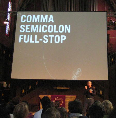
 The day started off with the ‘keynote’ by sociologist Harald Welzer. He likes talking and spoke about the Club of Rome’s Limits to Growth, how they have largely been ignored for decades, and how the unsustainability of our lifestyle is cemented by that fact. The current situation in Fukushima was used as a current example. One whose direct effects are not immediate and which could do with both good visualisation and less stupid media. Referencing last year’s see conference – where apparently a bunch of speakers couldn’t come due flight paths being closed after the Eyjafjallajökull eruption – he pointed out that (a) the world didn’t end without planes [some truth in that, I guess, but not in the way he suggested it as this was for a very limited period of time, so mere delays and inconveniences were the consequence, rather than a change of lifestyle] and that furthermore (b) everybody keeps arguing that not having planes or roads would make us suffer from being less mobile while (c) nobody is supposed to note that having roads and planes also make us suffer from noise and death – so there’s at least a tacit tradeoff being made there which is rarely questioned. He also made some points on the popular topic of CO2 emissions and rightly remarked that these also lack immediacy and people fail to communicate the real problems. He pointed out that the popular image of a ‘carbon footprint’ used for this topic is patently absurd as people can relate to neither carbon nor – living in a paved world – footprints.
 The next speaker was Carlo Ratti from Senseable City Lab at MIT. He highlighted how more and more aspects of our world and daily lives are closely related to data these days. Sensors, communication and data processing have become cheap and will become even cheaper. A lot of data are collected and increasingly used. Possibly to improve our lives [he didn’t touch the topic of how those data are mainly used to create profits which may be bad for our lives: to me it seems that the ‘bad’ guys put more effort into extracting useful information from the data]. He then presented a bunch of interesting projects their group made: Using communication data in Rome to visualise what people are doing and how they flow through the city. During Italy’s football world championship win and in everyday life. Apparently it’s hard to tell pedestrians and people in cars apart in Rome when all you know is the speed they’re moving at. A vision he presented was to create a bus system where the buses know when they are needed and appear; Nothing practical seems to have come out of that idea, though. Other data collections were the tracking of rubbish by putting extra electronics in it and drawing the results on a map; Sweet idea, but one wonders to which extent this revealed information beyond which kind of rubbish dumps and recycling facilities are where. Other projects involved ‘crowd-sourcing’, i.e. analysing pictures on flickr to find out where in Span spring is or where parties in Barcelona are. Possibly the most interesting info-graphic shown was a film with a map of Singapore, which was distorted according to the time you’d need to reach places. Nice show of rush hours. All in all, plenty of fun ideas in there, but they mostly didn’t seem to reveal much beyond the obvious.
Food queues in the following bread were so long that I settled for cake instead (yay!) and looked at the exhibition of student works in the basement. Besides hipster stuff like a fancy display for Twitter messages, I saw a system using that XBox infrared motion tracker to let people play virtual instruments. Unfortunately the software didn’t like me when I wanted to try it out. Another, spooky, project consisted of long flexible tubes in a dark room with lights at their end. It turned out some proximity detection was going on there and the tubes started moving a little and ‘looked’ at you with their lights when you approached them. Sweet.
After the lunch break, Alexander Lehmann spoke. He became an overnight YouTube star a few years back when he made a film taking the piss of the then running ridiculous Du bist Deutschland
campaign, renaming it Du bist Terrorist
and showing the image of a state suspecting all citizens as terrorists and thus being fully justified to terminate privacy and logging all the data they can. A good idea, executed so well that it became popular and then rocketed in popularity even more after people threatened to sue him, the poor design student, which made Alexander the star of the media. Nice if stories work out like that. He sketched how he works and stressed the difference between (static) graphics or text and working with video which, having a linear timeline, gives the creator great control over the pace of the elements the viewer focuses on. The debtris video by Information is Beautiful served as an example for that. As a bonus, his fame even got him a job doing satirical clips for a TV show.
 The following speaker was Brendan Dawes from Manchester. He spoke about his fun projects, the importance of enriching data with a human touch –
 data needs poetry
– and pointed out plenty of curious and sweet projects like his analogue weather indicator, his love of laser cutters or ‘analysing’ films by making big posters using many of their frames [an idea that has both a charming geekery for being so technical taken off with sites like moviebarcode appearing]. The latter even got him into New York’s Museum of Modern Art, but I’m not really sure I can tell what the point of his talk was.
 Speaker number five was Wesley Grubbs from Pitch Interactive in Madison, Wisconsin. His talk was the most interesting one of the day to me as he spoke about both sides of visualisation: going all the way from big data sets to appealing and insightful visualisations. In fact I may have seen some his works before as the programme said they were in the Science Express that toured Germany a while ago. He showed a few examples of his work and discussed the challenges in creating them. One was the difference between the funding of Obama’s and McCain’s election campaigns in 2008. All the official donations, 12 million of them, are public in the U.S. [great!], and with information about donors, their job, city and the amount of donation one can analyse and tell the (by now familiar) story that Obama got enough donations to buy the election but he did so by convincing many people to contribute a little rather than having a few huge donors contributing most of the money. Another story was about 311 calls – 311 apparently being the number you call in U.S. cities when there’s something non-dangerous you need help with, e.g. noisy neighbours or blocked driveways. For the hundred millionth call in New York they wanted to present the service, analysed the call records for a period of time and ended up with a diagram telling pretty much the life of the city by graphing the reasons for 311 calls throughout the day: When the ctiy tries and fails to sleep, when it sleeps, when people wake up, etc. A final example shown was a graph showing U.S. federal spending. Seeing it, it’s shocking – but not particularly surprising – that a huge chunk of the money is the defense budget. What turns this into a remarkable story, is to compare the fractions of the budget going into certain areas with the media coverage of the same areas. And there, a big disconnect becomes visible. One can understand that nobody wants to read about war all the time, but seeing that people appear to care a lot about education which gets a negligible fraction of the budget is sad.
 After the next break – hmmm, ice cream! – Joshua Prince-Rasmus from REX architects in New York spoke. He put on a great show and had amazing projects to present. His point – which seems to be the working method of their office – being that architecture is ‘just’ another instance of turning information into design as well. After giving a short historical introduction, politely expressing his distaste for the practical outcomes of Bauhaus architectures and 1980s skyscrapers, he introduced their ‘method’ of working. It consists of a big first step of understanding the client’s needs. In particular, that step is not about how things are built or how they look. The result of that analysis, backed by data, is condensed into statements about the needs and goals of the project which the client signs – and only then architectural planning begins. [I suppose this kind of ‘method’ drives away ‘bad’ clients quite easily, so you’ll need some kind of reputation to get away with it.] The first example he gave and showed was the new public library in Seattle which looks a bit odd but the looks were derived from the varying needs of different parts of library work [I think the library also has a clever way of integrating DDC classification in the setup of everything, but that may be beyond the pure architecture and wasn’t mentioned in the talk which focused on the fact that libraries in the 20th century are at least as much about public services and people than they are about books]. The next example was the Dallas Theatre Center. They were in a shabby building and had become quite famous for their productions. Apparently because of the old building which nobody cared about so directors could be super flexible, have holes in the roof and whatever else they wanted. Thus the needs they determined from that lead to a building flexible for many different setups and taking that to an extreme where the theatre’s main area is an empty hall on ground level, most walls of which can be removed. The stage and seating areas can be moved where they should be within an hour from above and below. Sounds and looked very clever and refreshing to me. Another remarkable project was a development for Louisville university which was made for a site so crappy the university got it for free (between a concrete wall and a motorway, potentially flooded, consisting of three pieces). The building was meant to be rented out in part to pay for the bits the university wanted. And after analysing that problem to death, they came up with a solution. I find it fascinating when people think in such a structural way. I started wanting to work for them. Even more so when Prince-Rasmus said everybody starting to work there will cry at some stage because everybody goes on crashing their ideas while trying to find the best one.
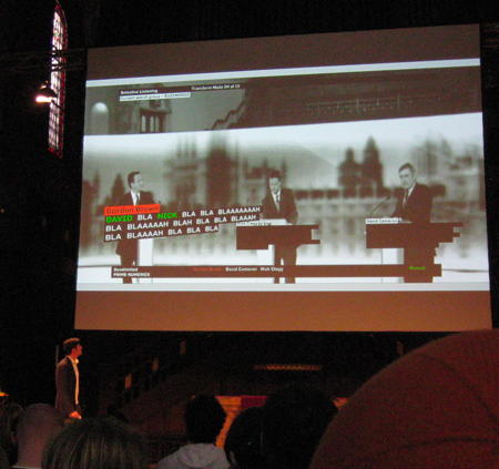 The final speaker was Justin Manor from Boston. He’s into live video projects and showed a lot of the ‘Prime Numerics’ project they did during election campaigns in the U.K. and U.S.: Discussions were typed in as they happened (apparently a real challenge to keep up with the ridiculous speaking speed of British politicians) and then the words were analysed in many different ways, leading to all sorts of visualisations of things like word frequency, word and sentence length, pronoun usage and so on. All that packaged in slick looking animated text and graphs put onto the live television image. That’s pretty cool but also pretty useless as the data analysis done is quite ad-hoc and wouldn’t qualify as serious in any way – a fact that Manor also pointed out himself. So this presentation was mainly visually interesting but fell short on the ‘information’ part. What wasn’t so great was Manor trying to connect to the big topic of sustainability attached to the conference at the end. He just didn’t have anything significant to say on that, so that ended up being a bit weird.
And that was the conference for me. As I travelled on to Heidelberg, I had to miss the evening party and the short workshop sessions announced for Sunday (Wesley Grubbs said he’d give some insight in the data analysis techniques used, which sounded very interesting). Big thanks go to Scholz & Volkmer advertising agency for organising the event.
One topic which unfortunately wasn’t really discussed at the conference is that of truth. Sure, a few speakers implicitly referred to it (e.g. Alexander Lehmann making satirical films which are by definition about truth, or the lack thereof, in politics or Joshua Prince-Rasmus mentioning that they couldn’t really plan a ‘zero-carbon-footprint’ building which was supposed to be built 20km out of the city centre as things have to happen inside cities to keep them energetically efficient), but the actual point was not made: Visual information can easily lie.
Less blatantly: We are quite visual by nature and we are inclined to believe things we see. A graph or image just sticks more easily than a big table of numbers which we have to read, understand and possibly analyse. As a consequence it is easy to create visualisations which are suggestive in the wrong way. Which means that creating such graphics brings great power and great responsibility with it. Both because people want to mislead the recipient of the information (I am sure all the advertising people who were there would have a thing or two to tell about that) and because they accidentally mislead due to wrong analysis or not thinking the perception of the visualisation through sufficiently.
Even simple, quotidian visualisations like bar graphs in newspapers are routinely ‘adjusted’ for display by cutting off their axes. When doing this there must be a line somewhere between cutting off the axes in a way that significant information becomes more visible and cutting off the axes in a way that makes a trivial change look dramatic. Where exactly that line is crossed will depend on the data used, the facts they describe, the people the graph is made for and the agenda of the people creating the graph. To me this issue looks like a pretty slippery slope. One that would be interesting to discuss. For the benefit of both the people who want to create ‘correct’ graphs and those who want to mislead.
Bonus links: Video streams, photos.


