Widgets
1172 words on Mac OS X
I’ve been told I’m too critical about Dashboard widgets. But of course I am not. Many widgets just look like they’re quickly assembled crap. Pretty quickly assembled crap, if we’re lucky.
 Note that I am not saying that the Dashboard per se is bad. It’s not. It’s a good idea to give you ‘information at your fingertips’ without having that information clutter your workspace or even your menu bar. I’d even move rarely used status items like the Bluetooth or Monitors menu to the Dashboard. And with Spotlight turning out to be quite lame in practice despite the cool technology behind it, the Dashboard may well be the new feature in OS X.4 that I use most frequently.
What’s bad about the Dashboard, however, is the decision to make widgets primarily HTML / JavaScript based. Not only does this give us loads of people making widgets who really shouldn’t. But it also makes it unnecessarily hard for widgets to behave like any other application on the system would. Most notably it makes it hard for widgets to use existing user preferences, or be localised. Note that I’m saying ‘makes it hard’ here. I’m fairly sure all of those things can be ‘done right’ in Dashboard widgets in principle, but achieving that suddenly elevates the difficulty of widget creation to a higher level. A level, that, for example, Apple aren’t prepared to master. And, because it requires widget creators to use techniques that are different from the standard Mac (Cocoa, say) ones, making a good widget will most likely be more complicated thanks to Apple’s design choice than it would’ve been had they used a supposedly more difficult environment for creating widgets.
Let me illustrate this on two examples that came to use thanks to the recent OS X.4.4 update. The first is the calculator widget. As discussed in my original Dashboard review the Calculator started off as a heap of crap because you just couldn’t use it with your numerical keypad if you didn’t happen to have a dot as a decimal separator. This may look like a minor point. But for one it isn’t if you are using one of the non-English languages that uses a comma as the decimal separator (particularly as Apple broke the Mac’s ability to set your decimal separator manually).
And secondly, this clearly demonstrates the technical or structural problem I’m seeing with the Dashboard: The number format problem is a well known one. It has been around for decades and it has been solved. Whether you’re entering numbers in Claris Works in 1993 or you’re using any non-broken Cocoa application today – decimal separators are not a problem you need to worry about. Because the System will know about your localisation preferences and interpret your input accordingly. Simple and useful.
JavaScript, however, either doesn’t know about such niceties at all or hides those features well enough for the average programmer to not know them. And that’s what’s bad about the whole JavaScript / HTML setup in the Dashboard. It’s not enough to focus on having pretty graphics and a few lines of JavaScript. You also need to reimplement all the things that you’d get for free in other environments.
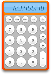 Well, for the updated calculator widget in X.4.4 they have – just half a year after the problem became blatantly obvious to thousands of users – added extra code and extra graphics to adjust the calculator to your preferences. Well, sort-of. It seems that the calculator now simply accepts both the comma and the dot key which is a reasonable compromise but doesn’t have the structural clarity you might wish for. Particularly when you observe that only pressing the dot key will be reflected by the comma key on-screen to be updated to its pressed state. Pressing a comma key will not.
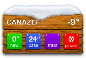
The next widget to discuss in this context would be the all new Ski Report widget. It’s a cousin of the weather widget. And the weather widget has been known for its non-existant localisation from day one. In addition it contains so many bugs with finding places (Berlin, CT anyone?) and does neither read your temperature scale preferences from the system nor simply default to °C nor store your choice that it’s downright embarrassing. [fix for the °C problem]
With that background I was particularly curious to see how the Ski widget works. Its code is partly taken from the weather widget (they both use the same web service and both have the odd ‘Celcius’ typo in there) but it seems to have been improved. Most notably it can store your preferred temperature scale. Woot! Of course it’ll still wrongly default to °F because the widget isn’t localised, but the problem just isn’t as bad this way.
 But this particular widget introduces another ‘challenge’ which Apple didn’t fail to get wrong. It displays snow heights. And a few people on Earth prefer to express those in inches. The people working at Apple, say. And where in the °C vs. °F case they were aware that there is a choice here, no such choice of measurement unit is offered to the user in the ski widget for the heights it displays. Which would be fine if the widget simply read the users clearly stated preference for metric units from the OS… but of course it doesn’t.
Indeed, a closer look reveals that there is no conversion ability whatsoever in the widget. And, even worse (I’m not joking here, I wish I was) the unit sign used by the widget is stored in the JavaScript file for the snow base height and in the HTML file for the new snow height. To top things off, the character used is obviously just the quotation mark ("), rather than the proper double prime inch sign (″). So enjoy the widget displaying a °C temperature along with snow heights in inches where one of the inch characters has been replaced by the proper one by me:
That was the topic of Apple widgets. The majority of widgets, however, aren’t made by Apple. And while I haven’t tried all of them, it’s pretty safe to say that the majority of them is at least one of ugly or superfluous. So to end on a high note let me mention iSlayer widgets. A number of widgets on offer which are reasonably looking and moderately useful. Most notably they have a full set of system stats in a tiny non-technical looking widget (apparently defaulting to °C for temperature display) and a battery indicator using a hen and her eggs as graphics.

Pretty, space-saving, fun. And with a choice of ‘free-range’ or ‘caged’, naturally. Exactly the software I like: Software that’s doing the job without losing its sense of humour. Or software that has a sense of humour without neglecting its job. And while I was at it I also grabbed a prettified old school Mac startup icon for my Dashboard:

Admittedly, that one is useless – but you will understand…

