X.5 Quick Look
3327 words on Mac OS X 10.5 Leopard
As I indicated earlier, Quick Look is one of the conceptually more interesting features of Mac OS X.5 for me. While it’s easy to enjoy its ability to display previews for many document types, there is more to Quick Look than meets the eye at first.
I shall look at the obvious parts of the Quick Look infrastructure first and then move on to a more detailed view along with some comments on how well it is actually used.
Basics
The most noticeable user of Quick Look is the Finder. Select a file, hit the space bar and a window will pop up, displaying a preview for the selected file. Very simple, reasonably quick and potentially quite useful. You’ll get static images for static files, but more interactivity when possible. For example, you can flip through the pages of PDF files, view films or even get a slide show of photos in the Quick Look Preview window.
Once you opened the Quick Look window, the Finder will keep track of your file selection and update the preview to match its current state as you move through your files. You can also play this game a bit more boldly and select several files at once, which makes Quick Look display all of these, so you can get a quick overview and pick the one you want. This even works for thousands of files in one go with Quick Look first shrinking the previews for each item to fit all of them into the window and then providing a user interface to page through the collection. Very handy. As a bonus Quick Look also has a ‘Play’ button which will play a slideshow of all selected items. With the Finder’s slideshow feature being somewhere between buggy and unpredictable in previous OS X releases, this is a great addition.

Apart from this prominent appearance in the Finder’s Quick Look window, the technology gets to do some more work behind the scenes. As can be easily guessed, the file icons used by the Finder’s new Cover Flow mode are also provided by Quick Look. As are, in fact, the file icons in Finder windows if you turned on thumbnail icons in your view options. This is even possible for tiny icons in column mode now.
Likewise, Stacks in the Dock and Time Machine’s Finder windows (obviously) use Quick Look to create previews, as do all file navigation dialogues in their preview columns and in icon mode. You will also see some Quick Look magic when using the sillily named iChat Theatre feature which lets you ‘show’ a document to your chat partner (more on that when I’m writing on X.5’s iChat).
QuickLook can also be used by other applications if icon thumbnails or previews are needed. Getting the image should be a single call. There may be even more to come for non-Apple applications if we read Apple’s note In addition, the private programmatic interfaces available to internal clients of Quick Look might one day be made available for third-party development (as API) in a future version of the Quick Looks framework.
optimistically.
Behind the Scenes
So how do things work?
Essentially Quick Look is nothing but a piece of infrastructure that takes files and gives preview images in return. The heavy lifting of actually creating the images is done by plug-ins. These receive a file URL, do their magic and then return the resulting image. The Quick Look infrastructure takes care of finding out the file’s UTI, keeping a list of the plugins that are available (in co-operation with Launch Services, I suppose) and piecing things together correctly.
Quick Look knows about two distinct types of graphics it can provide: Thumbnails and Previews. Thumbnails are the ones which are used for icons while Previews are the ones which are used in the separate Quick Look window which allows further interaction. While this separation appears strange at first, it quickly becomes very natural: Just look at some PDF files for an example. You will see that the icon thumbnail graphic aims to symbolise a document with some ring binding and pages being visible. Compare this to the ‘proper’ preview which displays the PDF as it should be displayed: On flat paper, with the ability to browse all pages, follow links and so on. The difference - and the necessity for it - quickly becomes quite clear.


[As the images above show there are additional tweaks that can be used to influence how previews are rendered and interacted with.]
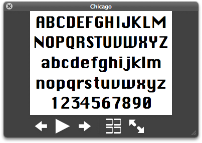
Poking around a little you will find that the system comes with the qlmanage command line tool. It is mainly meant for developers who want to try out their own plug-ins directly. But it’s also suitable for a bit of playing around. Apart from its administrative features you can run it as qlmanage -t $yourfile to see the thumbnail graphic for a file and as qlmanage -p $yourfile to see the preview. Other options let you set the size, scaling and more details and reading its output gives you an idea about the plug-ins your system knows and the one that was chosen.
Choosing the correct plugin is UTI based as everything in OS X which has to do with file types should be these days. Quick Look plug-ins state for which UTIs they can create images and Quick Look then uses them for the matching files. There seems to be a certain degree of hierarchy in there - meaning that plug-ins you have as a user can override those provided by the system for the same UTIs.
Is it any good?
Obviously I think that Quick Look is a great idea (and conceptually also an old one, I guess, at least it looked like they did similar, if not quite as powerful, things in KDE years ago) because it makes creating document previews a no-brainer. Applications can become richer because of that and let you operate more directly with files by presenting previews right in place.
There are, however, limits to this when it comes to using the icons Quick Look can provide. Not every file type lends itself to having a thumbnail icon - particularly at small sizes. Thumbnail icons are great for image files as seeing the image may save you the effort of reading the file name to find the file you are interested in. The same isn’t true for many other file types, be it plain text files, HTML files (which, for security reasons I assume, cannot load images from the internet for their previews) or even source code. In my experience, having preview images for these doesn’t make it easier to locate a specific file in a folder full of similar files: Even though all the files may be vastly different content-wise - a text on giraffes vs. a text an making cakes - their thumbnail icons look very similar.
As a consequence I think that Quick Look icon generators should be rather conservative in what they do. If it’s not helpful - or even harmful - to provide thumbnail icons, this shouldn’t be done. And it’s the responsibility of the Quick Look plugins to exercise the necessary restraint. Unfortunately, I think, Apple were a bit over-enthusiastic about their new technology here and X.5 ships with plenty of Quick Look plugins which are very keen to provide thumbnail icons even if those don’t provide a benefit in locating the file you want.
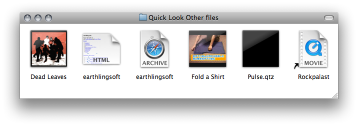
Let me just run through a few examples.The Good
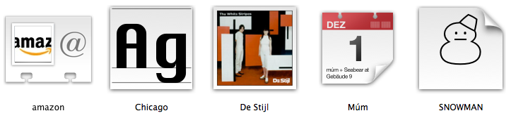
Some Quick Look icons are obvious hits. Most notably those for images which are really helpful just as the Finder displaying thumbnail icons for images has been for years (or how the custom icons in files for images have been in the pre OS X era). Others, which you wouldn’t think of immediately, are really neat as well and you soon start wondering how you did without these in the past. I particularly love the Quick Look icons created for fonts which do a great job at helping your ever-failing memory for font-names.
The icons we get for Address Book contacts with the person’s face displayed in their Address Book card are excellent as well and we also get icons for iCal entries with the date of the event on them. These last two are mainly aimed at usage in Spotlight as the actual files for this are usually hidden from the user, but they’re very neat nonetheless.

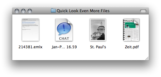
Invoking the preview gives even better results for some items:
There are more details for others as well. Such as a look at the addresses of a contact or the full details for an iCal event. It’s great when an effort was made by the plugin creator. I should also mention the Quick Look plugin that Bibdesk already provides. It gives you an excellent preview for each bibliography item. But the icons it provides as thumbnails are not particularly helpful in my opinion because it’s just impossible to display the necessary data of a bibliography item in a small icon.
The questionable
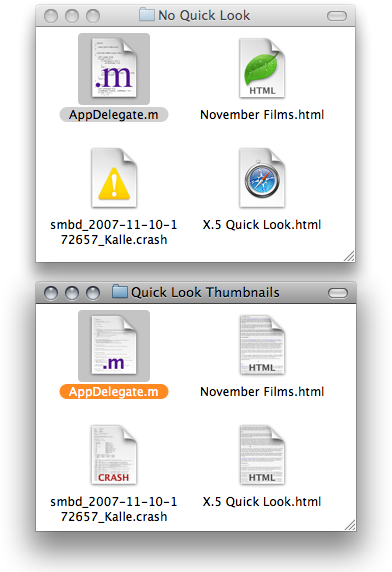
A number of the plugins Apple ship with X.5 suffer from the same problem. For example, all text files will get a preview of their text as an icon. And for any non-trivial text file this means that at best you can get a hint of the structure of the beginning of the text. But in my experience this doesn’t help you at all in most cases. As thumbnail icons are an all or nothing thing in the Finder, which either uses Quick Look to get them for all files or doesn’t use them for any, this means if you want thumbnail icons for your images, you’ll have to take them for your text files as well. Just tell me which of the following gives you a more precise idea about the documents you are seeing and what double clicking them will do:
Other Quick Look icon generators deliver inconsistent results. The PDF one, for example, is great for graphics heavy stuff or brochures. But if you have a folder full of maths papers with no images but the same title-abstract-section structure, it’s essentially useless. The same seems to be true for essentially all documents which don’t contain an easily recognisable layout or images. I.e. pretty much all documents associated to work for most people.
I’d say the usefulness of Apple’s PDF thumbnails varies widely and it strongly depends on the file in question. I also think that the idea to make the thumbnail look like a ring-bound stack of paper is totally sweet but it’s just too unreliable. What about documents in landscape format? Should those be bound at the left or at the top? It depends on the document which could be in landscape format or the result of some 2-up printing. Software will have a hard time figuring that out - and as far as I can tell it doesn’t even try. And what about documents written in Middle Eastern languages (and even a few Far Eastern ones)? Shouldn’t some of those be bound at the right rather than the left?

The same is true for pretty much all other text documents. In theory I think the situation could be better for web pages as those tend to have more vivid layouts and colours and thus might be easier to recognise in the thumbnail, but - for solid privacy reasons I hope - the Quick Look generator for HTML doesn’t load the page’s external resources such as style sheets or images which gives us the same messy display everything else has. And it goes downhill from there as Safari Web Archives which do have all the relevant resource inside them just aren’t supported by Mac OS X.5.1’s set of Quick Look thumbnail generators at all. Let’s hope Apple fill this gap soon.
Things are quite strange for films as well. For two reasons. One is that the thumbnail icons for film files are all square. Which means that most films are letterboxed with ugly black bars. Couldn’t those at least look somewhat film-like? I won’t even make the effort to bitch about the ‘reflection’ on the thumbnail. And then there is the image which is shown. It seems to be either an image from 10 seconds into the film or the keyframe which is set in QuickTime films. Few films have keyframes and 10s seems to be too short for films with opening credits. At least this heuristic seems to do the trick for downloaded trailers. Of course mainly the film creators are to blame for this if they don’t set a key frame which the Quick Look plugin can use, but I’d say that results are mixed. Sometimes you’re lucky, sometimes you aren’t.
Quartz Composer files are an equally mixed bag. With a tendency for the worse (go, browse the Quartz Composer examples in the /Developer folder). As Quartz Composer files don’t even need to draw anything or them drawing stuff may depend on external resources which aren’t loaded when being run by the Quick Look importer, numerous Quartz Compositions just look black. Not good. Particularly as the thumbnail icon looks just like that of a film. No indication of the file type whatsoever remains for the user to see.
Sound files are mixed as well. I really like how Quick Look uses the cover art in a music file for its icon. (I am tempted to bet that the people writing that Quick Look plugin cursed iTunes’ new-ish philosophy of storing cover art outside the sound files.) This doesn’t look that great if you have a folder full of files from the same album (as you probably have), but it is great in search results and does give you a fuzzy feeling about having made the effort to add all that cover art over the years. The preview used in the Finder’s info window sucks, though. Not only does it not display a play button until you hover over the cover art. It also lacks any control over the playback position and volume. Both things the previously used QuickTime controls offered and which were very useful - to skip over a quiet and lengthy intro, say.
Quick Look’s activity on e-mails is equally mixed. The most information you’ll get from this is a message’s length and, if you’re looking closely, the amount of quoted text. Not even images in the message are displayed in thumbnails. And other information like the sender’s image from the address book isn’t used either. Lame, I say. Things are much better for previews. You can read the full message with images in its original formatting. Just the sender’s image remains missing.
For iChat files the situation is more reasonable. They all just come with a standard iChat file icon and no thumbnail at all. Perhaps this could be augmented with the chat partner’s icon to help identification without reading. The preview for chats is good as well and it displays the whole chat with images and everything.
For image files, I have to add that I am a bit puzzled by the white border Apple leave around them. While this may be better for contrast on some backgrounds (not that Apple cared about that, seeing their current menu bar strategy), it also reduces the total size of the actual image by numerous pixels. Pixels are precious at icon sizes.
Let’s see how all this develops. It’s a first step, I suppose. But I also fear that it’s unlikely we’ll see less icons in the future than we have now. Which may be a bad thing.
Developing Plug-ins
 As seen in the examples above and by viewing a few Word, Excel or iApplication files, the system brings Quick Look plug-ins for the Apple owned and otherwise most-common file types along. Other applications have to bring along their own plug-ins if they want pretty thumbnail icons and previews for their files. To do that you will have to get your fingers dirty and do some programming.
However - unlike in Mac OS X.4 where creating the first Automator actions or (to a lesser degree) Spotlight Importers was a royal pain because documentation wasn’t that obvious and instructive and many little details played a role - creating Quick Look importers isn’t exceedingly hard and XCode 3 comes with a ready-made project type for this which sets up everything correctly. It seems like Apple learned a lesson in this area, and the speed with which plug-ins start to appear suggests that this was a lesson worth learning.
There are a number of approaches towards getting Quick Look thumbnails for your files. If your files are bundles rather than actual files, there’s even the option to just save an image file inside your bundle which will be displayed by Quick Look. In a way this seems like a cheap way out but it will certainly make sense for very large or complex documents for which creating a preview would require a lot of processing.
With that out of the way, the next option are the actual plug-ins. To write a plug-in you essentially have to create two methods. Both are passed the URL to a file (yup, no proper file references again, just crummy paths…), the UTI, the desired size of the image and some options. And they return the data representing the thumbnail or preview image. The two different image types also mean that you can optimise a litte: While there will probably be only one preview image on screen at a time, a user can easily open a folder with hundreds of files which will need thumbnail icons created as quickly as possible. Thus the plugin should aim to be fast at creating those images.
Now that already sounds very reasonable with just two methods to implement - hopefully using some of your existing code. But things are even better. Because you really do return data. And these data can be of several types. As a consequence it’s perfectly acceptable to not draw the image yourself but just return some HTML or an attributed string which the Quick Look engine will then take care of rendering.
Once you managed to program your own plug-in and tested it with the qlmanage tool, you can simply ship it with your application by placing it in its ‘Contents/Library/QuickLook’ folder (Some places of Apple’s documentation currently list ‘Contents/Library/Resource’ which is wrong). And that’s literally it.
And to make clear that I’m not talking out of my ass here, I tried making a Quick Look plugin and it was a smooth experience. For UnicodeChecker we started offering Spotlight integration a while ago. Due to Spotlight’s ‘clever’ design, that feature creates a file for each Unicode code point which has a name of its own or for which UnicodeChecker has a Unihan description (welcome a few ten thousand extra files and say good-bye to 150MB of disk space…). Each file’s information is then added to the Spotlight index and you can use Spotlight to search for ‘Snowman’ or ‘Ligature’ or ‘Roman Numeral’ and find the respective characters. If you have the Unihan database installed, you can also type in a word like ‘sturgeon’ and get all the Asian characters containing it in their Unihan definition in the results.
Of course letting these search results have the actual character as an icon would be tremendously helpful and save people many round trips to the UnicodeChecker application. And thus a little project was born which got results surprisingly quickly (the hardest thing was pondering whether an NSAttributedString or simple HTML would be preferable and how these would be used). And voilà:
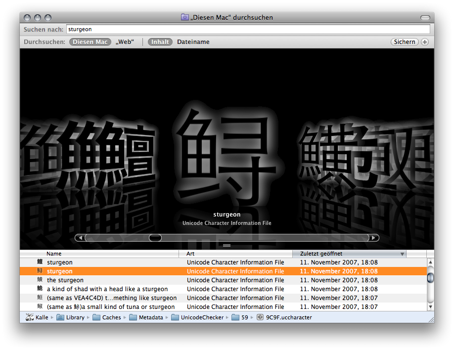
The plugin will be included in the next UnicodeChecker release. If you can’t await that, have a peek at our beta folder, grab the plug-in and drop it into a Library/QuickLook folder for the time being.


