Quarter Life Crisis
The world according to Sven-S. Porst
« Copywrong • Main • Things »
1015 words
After my recent post rebutting the suggestion to have a 16px font size in Safari an interesting discussion emerged helping me to sort out the facts better and – hopefully – make my point clearer. So here we go again. Some facts to begin with:
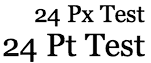 Running a little comparison of the respective units in Safari suggest that the constant Safari uses is about 4/3 (compared to 1.16 in Camino and 1.27 in Internet Explorer).
NSLog(@"%f", [[[[NSScreen mainScreen] deviceDescription] objectForKey:NSDeviceResolution] sizeValue].height); returns – surprise – 72.0: party like it's 1984.Thus the point to make is that while David asks a question about 16px, he actually isn't – as what Safari does has nothing to do with px, or pt for that matter, seeing that Safari doesn't care about the screen's resolution. Thus I tried to anticipate the reason for this, which in my opinion breaks down to a simple "'cos the text is too small", not taking into account all the technical arguments given here and in the preceding discussion.
Yes, there is something to fix. But it's not the font-size. Rather it is Safari's and probably OS X's capability to take into account a screen's resolution. Internet Explorer seems to be the only browser to do that. This is the way not only to get it right but also to accomodate both people with higher and lower resolution screens. It's also future-proof not needing more changes as screen-resolutions continue to increase.
This is quite a long post now, so I won't discuss the further points in detail and mention them only instead.

“Did anyone find the text too small in the past?”
Actually, I did.

I’ve taken the font-size prescription out of my “ugly but readable” style, we’ll see if anyone notices.

Probably it’s best to let everyone have their preferred font size. Although it’s only for the text right now.
To make everything scale well, I’d have to adjust all other units to ‘em’ I guess. Doing that while maintainig good looks is probably a bit more tedious and may require extra testing. So I’m going to be slow on that.

I was blown away when I realized (from reading the Aqua HIGs) that Aqua still measured everything in pixels, like System 6 did. Such a missed opportunity. It’s really sad that people with less-than-perfect eyesight are forced to use a lower, chunkier resolution — rather than being able to choose a larger, more detailed rendering at high resolution.
You cite Windows’ “Large Fonts” option as a solution, but sadly, it only solves a small amount of the problem. For example, at the cafe, we have one Win98 computer where the taskbar malfunctions (apparently irreparably) only at 800×600 resolution, so I’ve set it to use 1024×768 instead. To make it as readable as the other computers, however, I also had to change:
And “Large Fonts” only works semi-reliably at its recommended level of 120 dpi — even then, some dialog labels in Microsoft Office apps get chopped off. Any larger than that, and most applications stop displaying properly. (One notable exception is Mozilla: its UI labels, menus, and dialogs scale appropriately whatever dpi level you choose, though checkboxes and other bitmapped controls are rendered at the same small size.)
Obviously I don’t know too much about Windows - having tried to keep me exposition to it to a minimum. I just saw it and thought it might be a good idea.
On the web browser level, of course all those pixelated web sites are at fault as well. Doesn’t Opera have a ‘zoom’ option that also enlarges graphics and buttons instead of increasing the resolution for fonts only? I think I saw it once and it does look appalling. But at least people with eyesight problems may be able to see everything.
At the end of the day people would probably need to use vector graphics everywhere to ensure real resolution independence. I don’t see that happening soon as firstly vector graphics are imo harder to create than pixel graphics, perticularly if they are to look neat (and rendering them takes more resources) and secondly they ofte render non-optimally at the small sizes required by today’s screen resolutions.
Opera’s zoom function is annoying firstly because, most of the time, you only want to zoom in and out on the text and not the graphics. When Opera zooms the graphics as well, often this makes the page wider, so the end of each line of text disappears off the edge of the window, so the text ends up being harder to read rather than easier. Secondly, a large proportion of Web graphics look really ugly when scaled to a level which is approximately but not exactly 100 percent (even when nicely interpolated).
You could have separate zoom levels for text and graphics, but that would be too complicated for most people to understand. A smarter solution (one devised by Todd Fahrner, and yet to be implemented in any browser I’ve seen) is to have a single zoom level which applies to both text and graphics, except when the zoom level is between about 50 percent and about 200 percent; in that range, display graphics at 100 percent and only scale the text. (Todd wanted those thresholds themselves to be configurable, but even that probably would be too complicated.)
Getting vector graphics to look good at low resolutions requires hinting them for commonly used resolutions. Fonts are the most thoroughly practiced example, but the same applies to icons and Web graphics.
I agree on you assessment of things being too complicated. I think that’s ‘too complicated’ not in the intellectual sense ? after all the consequences can easily be describer ? but more in the ‘can’t be bothered’ department. I think this is the reason for many pieces of software to be so hard/not-fun to use: Everything is described and can be done, thus the programmers did their job. But normally nobody really wants to make all those decisions or care about it.
The zooming method you describe sounds good: It should be both easy to implement and giving reasonably good results. I’m not sure how it would play with ‘standards compliance’, but it should definitely be a good compromise.
« Copywrong • Main • Things »
