background-position
805 words
I have an amusing – or potentially not so amusing – question for the CSS buffs. And no, it’s not the kind of question where the aim is to figure out the correct amount of slashes and stars to make things look all right in Internet Explorer. To me this looks like an actual CSS question. One, in fact, where at least one of the spec, Safari or Firefox will look bad in the end.
What I’m dealing with is background positioning. Using background-position you can specify the background’s vertical and horizontal positioning using either lengths or percentages. Using percentages for this looks really curious at first. The CSS 2.1 spec says:
With a value pair of ‘0% 0%’, the upper left corner of the image is aligned with the upper left corner of the box’s padding edge. A value pair of ‘100% 100%’ places the lower right corner of the image in the lower right corner of padding area. With a value pair of ‘14% 84%’, the point 14% across and 84% down the image is to be placed at the point 14% across and 84% down the padding area.
So you’re not specifying where the edges of your background graphic goes, but rather specify where a specifically located point of your background graphic goes. I still haven’t made up my mind whether this is a neat and elegant way to cover exactly what is needed – making sure some bit of the background graphic is just in the right place while making sure that definition is reasonably invariant under size changes – or whether it is a bit confusing and makes you life unnecessarily hard. Currently I tend to favour the first option as – indeed – it lets me do exactly what I want to do, just that it’s written up in a cleverer way than I had originally anticipated.
But let me give an example. Let’s say I want a background that is two thirds red at the left and one third grey at the right. A way to do this would be to use a rather wide graphics file with just those properties:

Then I can use the background-position:67% 0%; statement to get it correctly positioned within my element – as is demonstrated in this paragraph. So while the graphic above is just an ordinary img element, the graphic behind this paragraph is an actual background graphic. Try resizing the window and see how the location of the colour change remains at two thirds of the paragraph width [or not quite because CSS percentages seem to be integers only, thus explaining the small difference between the background of this paragraph and the image above you may be seeing]. For a semi-trivial background as this one this is as good as horizontal scaling!
But let’s go a step further now. What’s particularly charming about this way to use background graphics is that you can apply them to the body tag to get a non-trivial background for all of your page without having to worry whether there is enough content in the page to actually cover the whole area. That is rather neat, tried and tested.
If, however, you start having elements of a fixed or minimum width on your page which make the width of your body exceed that of the viewport, strange things start to happen. And in particular, the behaviour of Safari and Firefox will differ significantly – a situation which luckily has become quite rare in real-life situations these days. In a sufficiently wide window my example page will look just like expected in both Safari and Firefox:

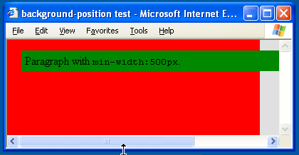
Once I reduce the window’s width beneath 500px, things start looking differently. In Safari like this:
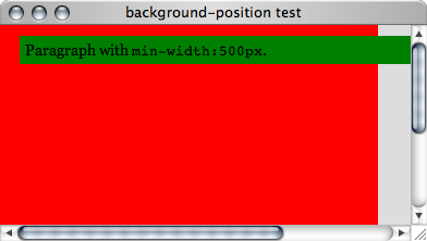
and in Firefox like this:

Note how the visible background in Friefox maintains the 2/3 to 1/3 ratio… as long as we don’t scroll to the right, that is. In other words, Firefox seems to interpret the percentages for background-position in terms of the pages viewport while Safari uses a percentage of the size of the actual element – the body element in this case.
I’m not particularly good at spec reading, but I’d say that Safari is the one sticking to the spec here as the bit of spec that I quoted above only mentions the padding area
and doesn’t mention the viewport. And to me that makes sense as you can scroll and the usually the design should be maintained in total even when scroll bars are present.
It’s a shame that there is a difference between browsers here as that essentially means the technique stops working reliably as soon as you have non-tiny fixed or minimum width elements on your page.
Oh, and just in case you were wondering… IE6 behaves just as Safari does in this case. So hooray for IE6: