see conference 2012
1318 words on Travel
After enjoying last year’s see conference on data visualisation, I decided to attend once again this year, also taking the time to visit the post-conference workshops.
Once more, both the event’s organisation and atmosphere were excellent. Many thanks to the organising ad agency for that! This year’s conference topic being sustainability meant that the focus went beyond everyday design opportunities but also considered the global impact of the work.
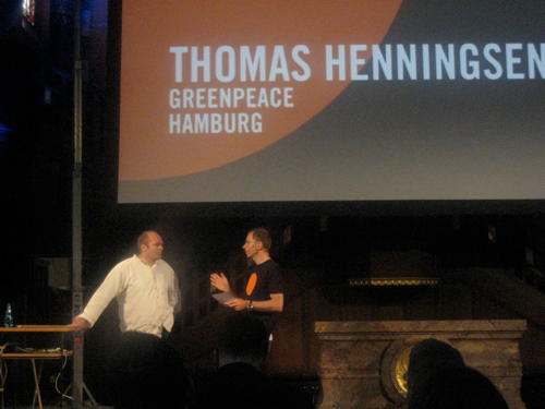
The opening talk was given by Thomas Henningsen of Greenpeace. He presented a film showing images created by Greenpeace of the decades, noting that the visuals play a huge role in raising awareness. Not only by illustrating the issues at hand but also by highlighting the power difference of the huge corporate tanker fighting off people in tiny boats. Arguable Greenpeace have mastered this channel of communication over the decades (although Henningsen showed a few photos where they failed communicating on symbolic or even technical levels as well).
The focus in this style of communication is on photographic imagery. Even if the information to be communicated is based on data, it is often visualised in photos, for example by showing a typically sized fish caught 50 years ago, next to the typical size you catch today. The final part of the talk was dedicated to rainforest and how Greenpeace try to use before (seemingly infinite rainforest) vs. after (seemingly infinite soy bean plantations) imagery to illustrate the natural resources destroyed there.
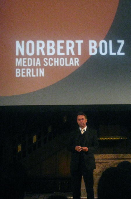
The following speaker was Norbert Bolz, a communication theorist from Berlin. Giving the only talk without any visual aides he focused on how the use of images changed communication in the last two decades, apparently known as the Iconic Turn.
Media such as newspapers have embraced images in that time, for their ability to provide concise messages and firing straight into people’s brains. This is problematic for reasons such as a shift in the topics chosen by media (if you can’t take a photo of it, it won’t make it to the title page) as well as the fact that you can hardly argue with – or negate – an image.
Then Bolz touched the topic of information, noting that information itself is not interesing and typically only information you have a personal interest in has a chance of making its way through. Usually more information will not help you reach a reasonable decision, it will rather increase confusion. A fact that marketers love and most product searches on the internet support, I guess.
The big problem there seems to come from our limited ability to absorb information. And our questionable skills at determining which parts of the information we receive are worth considering: there is a strong bias towards information looking new and interesting rather than to it providing new facts; and there is also the problem with the most important pieces of information in some context not necessarily being those containing the biggest amount of data.
Bolz returned to the topic of design by presenting it as the ‘rhetorics of the technical world’, which gives (interaction) designers great power and responsibility.
In the lunch break (really nice cake at the stall there!) I took a look at some of the student projects shown in the basement. Once more fun and interesting stuff there. It ranged from a EEG ‘headset’ that uses your brainwaves to draw coloured graphs, to a potential installation for a bar or so which uses a camera to pick up the colour of the guests’ clothes and then picks that up to adapt the ambiance accordingly.
More directly data driven exhibits resulted from a project on prototyping that resulted in a book with instructions that should allow people to develop protoypes quickly. It seems that VVVV (apparently Windows-only) is the tool-du-jour for such projects which provides plenty of I/O interfaces, graphics capabilities and a graphical interface suitable for non-programmers. Is it Quartz Composer or steroids or does it suffer from similar inconveniences once you reach a certain level of complexity?
Another project tried to develop software to simplify the classification of resources by their properties. It used the really nice idea to visualise the result, thus giving a greater incentive for people to complete the classification. However, that was really purpose-made and used a very small vocabulary for the classification. So it would not be suitable for the typical tasks people in a library do.
After the lunch break the unique location of a church was used to have a short organ-concert (apparently purpose composed for the occasion). Then Stefanie Posavec spoke about her work coming from book design and engaging in a bunch of data projects. Her method is decidedly non-technical, meaning that she takes the chore of manually counting and adding the information upon her to create the graphics she makes. Accordingly she considers herself a data illustrator rather than some kind of analyst.
Being a technical a algorithm-minded person myself, I find that approach quite alien; If only because it misses the opportunity to let machines do the gruntwork and free the time for the tasks that cannot be automated as well. But as Posavec does not claim to be a data-wizard and does continue her manual work all the way through, the whole concept is consistent.
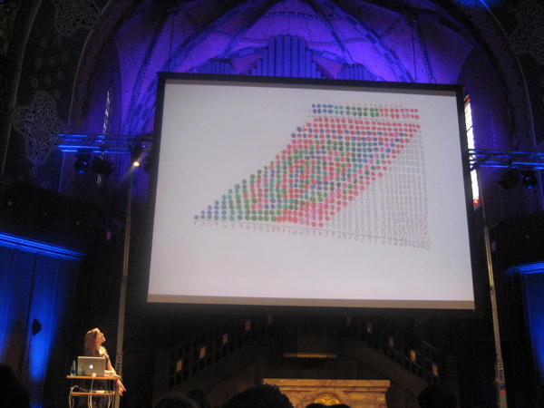
I really enjoyed her coloured long-multiplication images, by the way. Once again it’s a thing which seems like a lot of work and which due to its algorithmic nature does not require manual execution (and I’m pretty sure you’ll be able to explain most of the patterns with some basic number theory which should give a much better understanding). Still it seems like a fun and playful way of approaching such a dry topic:
The following speakers, Ben Kreukniet and Yannick Jaquet presented their work on light and projection design for events or shows, showing off a bunch of the projects they worked on. While some of them do look fascinating, I don’t think I care terribly much for these things.
After a further break, documentary director Michael Madsen spoke about his work on Into Eternity on a nuclear waste disposal site in Finland. His fascination for the topic comes from the fact that such a site is the first really long term project. If it takes a hundred thousand years for the waste to become reasonably less dangerous, what can be done to make sure nothing goes wrong with it in the meantime?
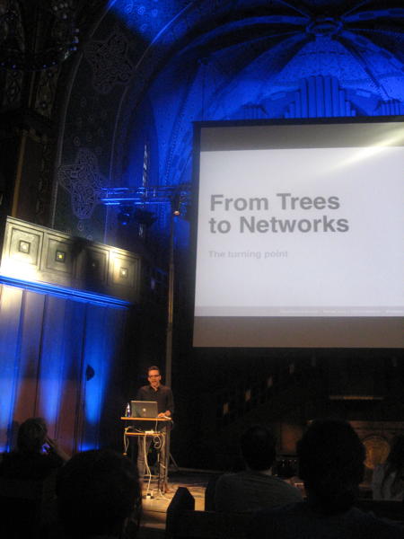
The final talk was by Manuel Lima who is known for his book and website on Visual Complexity. He showed many examples of graphs of recent years, and of centuries past, showing trends (an reoccurrences of old ideas). In the process he noted that the structures used in visualisation evolved from simple trees to more complex network graphs.
After our recent trip to Barcelona I particularly enjoyed this visualisation of tourist movements in Barcelona based on geotagged photos.
The following day there were a few ‘workshops’ which gave four of the speakers the opportunity to speak about the way they work. Michael Madsen highlighted that it’s important to fully immerse into a documentary he makes to get a great result and that information is not key, but understanding is.
Manuel Lima mentioned The Album of Science (apparently hard to find, but our library has a copy…) as a cool book for finding historical visualisations and gave the example of a study of classroom interaction which shows an animated network. My impression is that it’s really hard to get animation and automatic graph layout together (and while doing it, this example also lacks the aesthetic quality of many others).
Stefanie Posavec elaborated a bit more on her ‘manual’ work technique. In discussions the Scriptographer extension for Illustrator was mentioned which may reduce the pain of at least some repetitive tasks in the application.
Bonus kudos go to whoever picked that excellent photo projected behind Michael Madsen:
