Quarter Life Crisis
The world according to Sven-S. Porst
 With Unicode 8 having been released earlier this month, UnicodeChecker received an update as well to provide you with the latest Unicode standard out of the box.
Go and grab your copy while it’s still hot to enjoy those precious few of the new codepoints that there are actually glpyhs for in OS X 10.10 (Skin colour modifiers U+1F3FB…U+1F3FF, unfortunately no unicorn face U+1F984 yet).
Apart from that this update brings just a few small UI improvements.
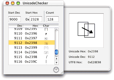
While testing this release, the question came up which old artifacts of UnicodeChecker still exist. Going through old backup DVDs – which luckily were still readable – we could find a copy of UnicodeChecker 1.0 … a 34KB StuffIt archive containing an application I can only run on MacOS X.6 in VMWare these days. There’s even a heavily pinstriped screenshot from November 2001, presumably on Mac OS X.1 to go with it:
23:55
• Feedback (0+0)
Thursday, February 19, 2015
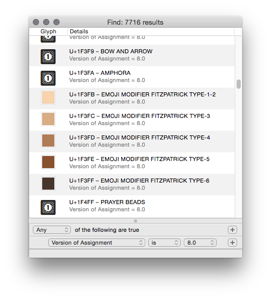
Thanks to Steffen’s efforts – there’s finally an update to the codepoint geek’s favourite UnicodeChecker again!
The update includes support for Unicode 7 as well as a powerful advanced search window:
Little improvements I particularly like are those to the Utility window’s Split Up tool. It will now display each codepoint’s offset in the string and display each selected codepoint to the main window.
To keep up with Apple’s pace in backwards incompatibility and style, support for OS X versions older than X.7 has been dropped and the icon has been flattened. In addition to that, Growl support has been removed in favour of OS X’s Notification Center.
Enjoy!
0:17
• Feedback (5+0)
Wednesday, August 6, 2014
 I has been four years since the last update to Earth Addresser, our application that gives you a nice visualisation of your contacts’ addresses in Google Earth. That’s a long time in the computer world.
Which is to say that the application had stopped working completely, mainly because Google maps stopped supporting external applications (for free). While this issue could be neatly – and surprisingly easily – fixed by using Apple’s CoreLocation framework which has been available on the Mac since OS X.8, actually doing so ended up being a lot of work.
A lot of work because four years since the latest version and essentially seven years since the creation of the code base are pretty much an eternity in Apple’s development world. While the Cocoa basics still work just fine, many things have been added to the system, while others have been deprecated. Hence a lot of work was necessary to make the application reasonably up-to-date and take advantage of current technologies.
Add to that the fact that this application started off as a hack based on a single class named ‘Magic’ which cried to be split up at least a little for sake of maintainability and that it really should use the Sparkle framework for automated updating, there was even more work to do.
That said, the work is done. While still a silly app, Earth Addresser is now a silly app which is slightly more up to date and not completely driven by Magic. It stopped working on Mac OS X.4-7. It gained first class updating (including Sparkle seems to have become a lot easier since the last time I tried it a few years ago), a preferences window to make a few possibly language or region specific choices user-configurable and a home on github.
Enjoy.
12:42
• Feedback (2+0)
Tuesday, December 3, 2013
While the web did improve considerably in the past decade I keep being impressed by developers’ insistence on creating broken forms.
Broken as in: refusing or breaking reasonable looking input for no apparent reason. Non-ASCII characters are always good things to try if you want to see high-tech FAIL.
For example when buying Arcade Fire’s Reflektor album online with Topspin media, their site (a sweet home to broken web design), kept marking the city name “Göttingen” as an error by marking it red and refusing to submit the form. Of course it did not tell me what exactly it considered wrong with that correct input, but luckily I know the “ö” to be good at finding programmer failure.
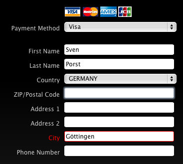
Note that in that form I did not even try to use my first name as I usually do but I left it at “Sven” only. Which of course is not what is in my passport or on my credit card, so I am a bit weary to use the “wrong” name there. To their credit: the credit card company has not complained so far about such minor differences in name. But I am a bit uneasy using the “wrong” name on airline tickets given the horrendous amount of mindless rule-following and stupidity in the airline and associated “security” businesses (yet I keep being forced to enter the “wrong” name due to the brokenness of many aviation industry systems, as first seen with Lufthansa a decade ago).
When filling another form recently – one that I suspect to be completely unrelated to ancient legacy systems as they may exist in airlines – I was reminded that even that bug remains alive and kicking. And the website recommended I should please check your first name
. Err thanks:

I will be the first person to agree that input validation is important and I do appreciate efforts to validate input. With that in mind, I completely fail to understand why developers do not try to make their systems and databases as open minded as possible for the values they accept. In the case of names and place names that would reduce both users’ frustration and the effort needed to validate inputs, because that global range customers simply do have names and addresses that do not fit a 1960s American mindset.
21:08
• Feedback (0+0)
Tuesday, October 22, 2013
I’m probably the last person to run into it, but I still think it shows quite a dedication to irrelevant details by Google Maps to add shadows to their graphics for buildings they have 3D shapes on depending on the time of the day.
Default view for SUB Göttingen:

The same in the early afternoon:

… and in the late afternoon:

Of course this is more spectacular for higher buildings. E.g. the TV tower at Berlin Alexanderplatz in the early afternoon:

… and in the late afternoon:

I would have guessed that serving different images depending on the time of day forces the creation of so many additional tiles that it would not be economic. Perhaps I was wrong about the number of additional tiles needed as the shadows only appear at high zoom levels for buildings that have 3D data available. Or Google are just showing off their advertising cash…
0:54
• Feedback (0+0)
Saturday, October 5, 2013
An interesting side effect of the current U.S.A. shutdown is that they actually make the effort to not just stop paying their staff but that they shut down their computer services as well.
Pretty much all of us have seen the shutdown notice you see these days when visiting, say, nasa.gov:
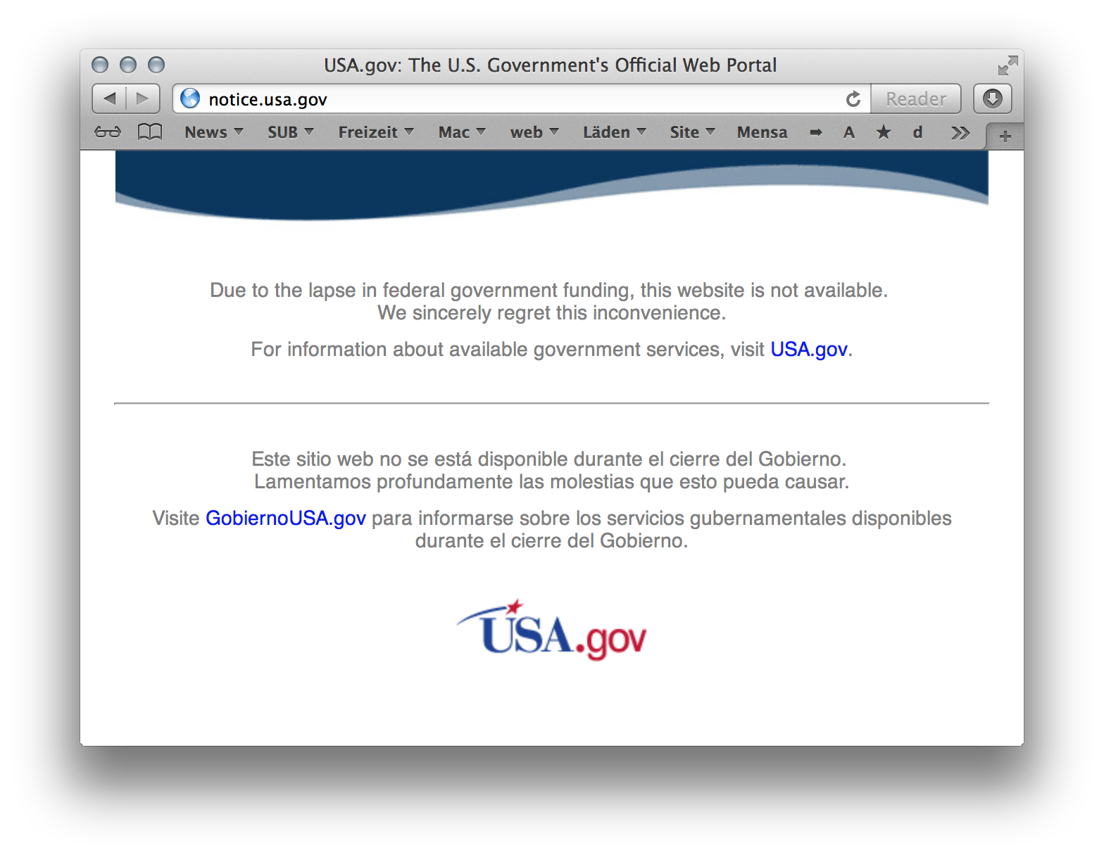
Let’s just hope they consider running stuff like GPS or not crashing the ISS as equally »essential« as spying on everybody over in the U.S. It may also be a good opportunity to take a look at the style of U.S. government sites which seem to have a visual language of their own.
The Library of Congress was offline as well (but seem to have a running website again now):
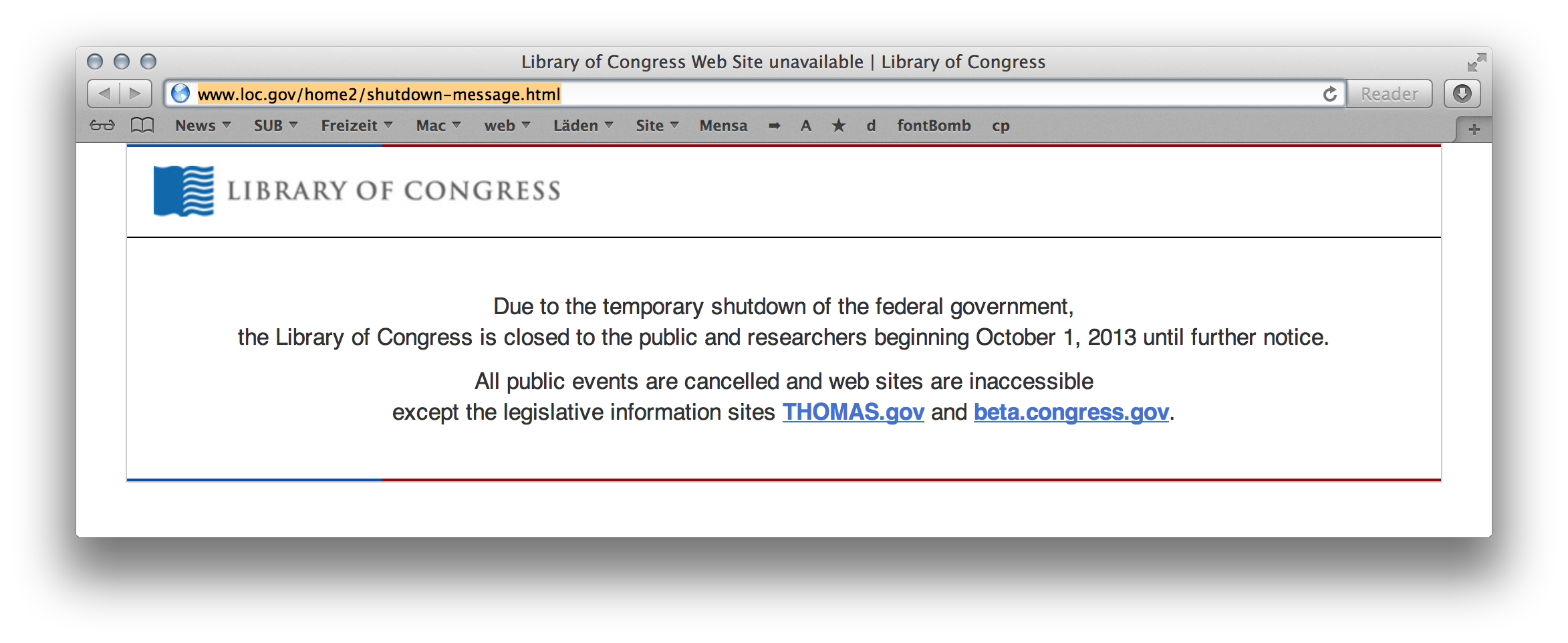
… a detail which seems to have plenty of fun consequences as they host numerous library standards and the XML Schemas of the formats belonging to them on their site. Really makes you think to which extent you can – or should – rely on online resources and how much effort it is to proof your software tools against failures like this one. Just imagine having software which relies on those schemas for some kind of validation and not being able to load them…
A curious further observation was the following: even somewhat obscure services like the NAL’s Z39.50 server stopped working (dutifully observed by nagios):

To me this suggests that either they just disconnected the complete networks of the respective government agencies or they made a real effort to shut down each and every one of them. It will be interesting to find out which of both … and in the latter case why they make this effort which could well be more expensive then just keeping everything turned on.
13:09
• Feedback (4+0)
After enjoying last year’s see conference on data visualisation, I decided to attend once again this year, also taking the time to visit the post-conference workshops.
Once more, both the event’s organisation and atmosphere were excellent. Many thanks to the organising ad agency for that! This year’s conference topic being sustainability meant that the focus went beyond everyday design opportunities but also considered the global impact of the work.
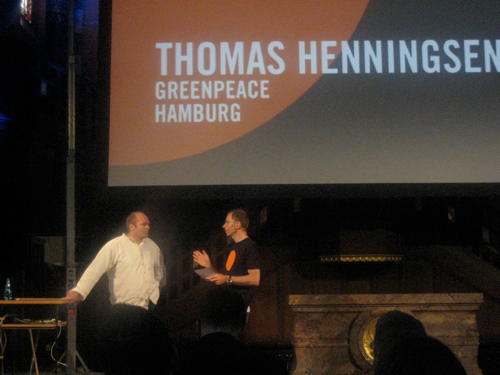
The opening talk was given by Thomas Henningsen of Greenpeace. He presented a film showing images created by Greenpeace of the decades, noting that the visuals play a huge role in raising awareness. Not only by illustrating the issues at hand but also by highlighting the power difference of the huge corporate tanker fighting off people in tiny boats. Arguable Greenpeace have mastered this channel of communication over the decades (although Henningsen showed a few photos where they failed communicating on symbolic or even technical levels as well).
The focus in this style of communication is on photographic imagery. Even if the information to be communicated is based on data, it is often visualised in photos, for example by showing a typically sized fish caught 50 years ago, next to the typical size you catch today. The final part of the talk was dedicated to rainforest and how Greenpeace try to use before (seemingly infinite rainforest) vs. after (seemingly infinite soy bean plantations) imagery to illustrate the natural resources destroyed there.
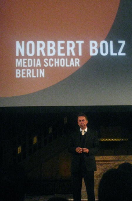
The following speaker was Norbert Bolz, a communication theorist from Berlin. Giving the only talk without any visual aides he focused on how the use of images changed communication in the last two decades, apparently known as the Iconic Turn.
Media such as newspapers have embraced images in that time, for their ability to provide concise messages and firing straight into people’s brains. This is problematic for reasons such as a shift in the topics chosen by media (if you can’t take a photo of it, it won’t make it to the title page) as well as the fact that you can hardly argue with – or negate – an image.
Then Bolz touched the topic of information, noting that information itself is not interesing and typically only information you have a personal interest in has a chance of making its way through. Usually more information will not help you reach a reasonable decision, it will rather increase confusion. A fact that marketers love and most product searches on the internet support, I guess.
The big problem there seems to come from our limited ability to absorb information. And our questionable skills at determining which parts of the information we receive are worth considering: there is a strong bias towards information looking new and interesting rather than to it providing new facts; and there is also the problem with the most important pieces of information in some context not necessarily being those containing the biggest amount of data.
Bolz returned to the topic of design by presenting it as the ‘rhetorics of the technical world’, which gives (interaction) designers great power and responsibility.
In the lunch break (really nice cake at the stall there!) I took a look at some of the student projects shown in the basement. Once more fun and interesting stuff there. It ranged from a EEG ‘headset’ that uses your brainwaves to draw coloured graphs, to a potential installation for a bar or so which uses a camera to pick up the colour of the guests’ clothes and then picks that up to adapt the ambiance accordingly.
More directly data driven exhibits resulted from a project on prototyping that resulted in a book with instructions that should allow people to develop protoypes quickly. It seems that VVVV (apparently Windows-only) is the tool-du-jour for such projects which provides plenty of I/O interfaces, graphics capabilities and a graphical interface suitable for non-programmers. Is it Quartz Composer or steroids or does it suffer from similar inconveniences once you reach a certain level of complexity?
Another project tried to develop software to simplify the classification of resources by their properties. It used the really nice idea to visualise the result, thus giving a greater incentive for people to complete the classification. However, that was really purpose-made and used a very small vocabulary for the classification. So it would not be suitable for the typical tasks people in a library do.
After the lunch break the unique location of a church was used to have a short organ-concert (apparently purpose composed for the occasion). Then Stefanie Posavec spoke about her work coming from book design and engaging in a bunch of data projects. Her method is decidedly non-technical, meaning that she takes the chore of manually counting and adding the information upon her to create the graphics she makes. Accordingly she considers herself a data illustrator rather than some kind of analyst.
Being a technical a algorithm-minded person myself, I find that approach quite alien; If only because it misses the opportunity to let machines do the gruntwork and free the time for the tasks that cannot be automated as well. But as Posavec does not claim to be a data-wizard and does continue her manual work all the way through, the whole concept is consistent.
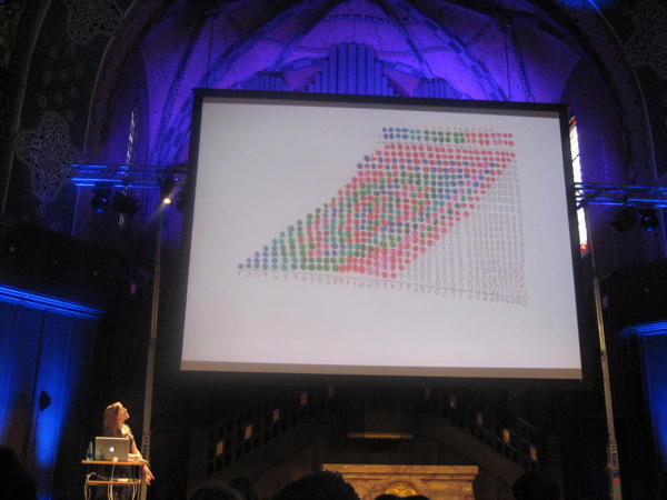
I really enjoyed her coloured long-multiplication images, by the way. Once again it’s a thing which seems like a lot of work and which due to its algorithmic nature does not require manual execution (and I’m pretty sure you’ll be able to explain most of the patterns with some basic number theory which should give a much better understanding). Still it seems like a fun and playful way of approaching such a dry topic:
The following speakers, Ben Kreukniet and Yannick Jaquet presented their work on light and projection design for events or shows, showing off a bunch of the projects they worked on. While some of them do look fascinating, I don’t think I care terribly much for these things.
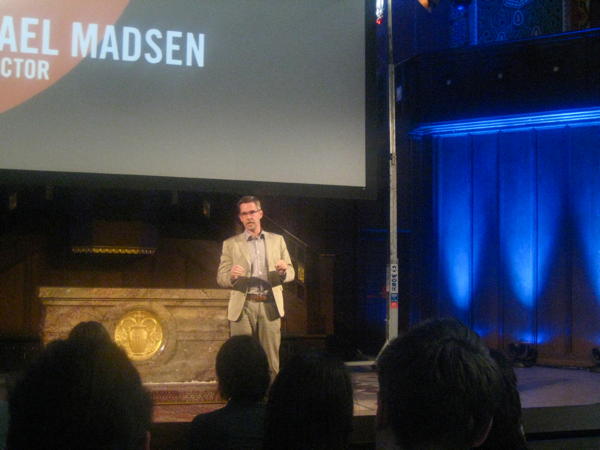
After a further break, documentary director Michael Madsen spoke about his work on Into Eternity on a nuclear waste disposal site in Finland. His fascination for the topic comes from the fact that such a site is the first really long term project. If it takes a hundred thousand years for the waste to become reasonably less dangerous, what can be done to make sure nothing goes wrong with it in the meantime?
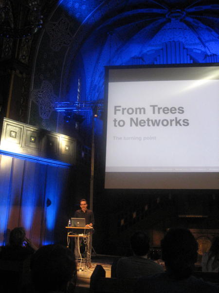
The final talk was by Manuel Lima who is known for his book and website on Visual Complexity. He showed many examples of graphs of recent years, and of centuries past, showing trends (an reoccurrences of old ideas). In the process he noted that the structures used in visualisation evolved from simple trees to more complex network graphs.
After our recent trip to Barcelona I particularly enjoyed this visualisation of tourist movements in Barcelona based on geotagged photos.
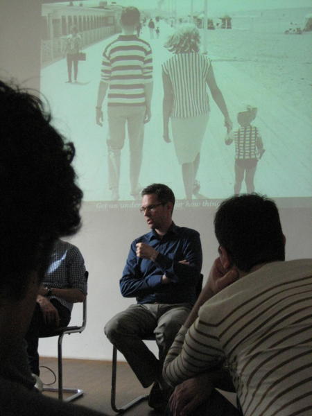
The following day there were a few ‘workshops’ which gave four of the speakers the opportunity to speak about the way they work. Michael Madsen highlighted that it’s important to fully immerse into a documentary he makes to get a great result and that information is not key, but understanding is.
Manuel Lima mentioned The Album of Science (apparently hard to find, but our library has a copy…) as a cool book for finding historical visualisations and gave the example of a study of classroom interaction which shows an animated network. My impression is that it’s really hard to get animation and automatic graph layout together (and while doing it, this example also lacks the aesthetic quality of many others).
Stefanie Posavec elaborated a bit more on her ‘manual’ work technique. In discussions the Scriptographer extension for Illustrator was mentioned which may reduce the pain of at least some repetitive tasks in the application.
Bonus kudos go to whoever picked that excellent photo projected behind Michael Madsen:
23:28
• Feedback (0+0)
Saturday, February 18, 2012
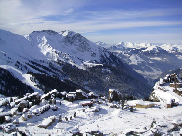
After last year’s great ski trip to Italy, this year’s destination was Montriond in the Portes du Soleil ski resort in the French/Swiss Alps. As ski resorts go when you’re not living in the mountains, getting there was a bit of a nuisance: eight hours on trains plus a 90 minute bus ride and gave ample opportunity to watch countries and landscapes go by. On the way I got the impression that Switzerland is overrated: trains may be on time, but they are not particularly fast; the mountains are pretty but the villages you pass through look as uninspired as their German counterparts; somehow it looked better on TV.
The appartement we rented was very spacious, its ten beds easily accommodating our group of eight, there being two lounges for relaxing, a nice kitchen-slash-eating area and a lift opening right into the appartement (really as good as it looks on TV). In some parts of the flat one could even find an open WiFi connection. That said, some aspects of the flat seemed a bit odd. The primary one being the countless light switches on the walls for controlling many lights, none of which really lit the areas we used for reading or chopping as well as we wanted them to.
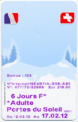
Given our talent in picking the worst possible week for skiing, this year’s excursion matched the week of the U.K. half-term holidays. Meaning that the whole ski resort was filled with English people. In fact – despite being France – the whole area seemed very welcoming to English speakers. Many of their (bad) websites are available in English and you can easily get by speaking English as well.
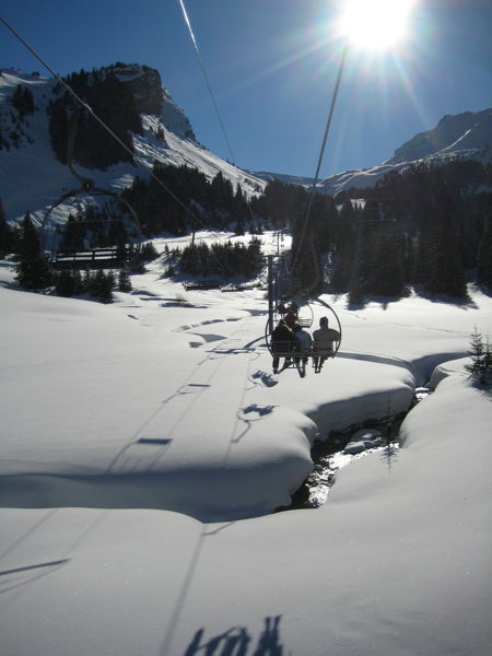
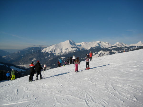
While heavily penetrated by ski pistes, the mountains and landscapes remain beautiful, and the Portes du Soleil ski area includes more than two hundred lifts and pistes, giving all of us the slopes adequate for our respective skillsets. Generally the lifts seemed older and slower than the ones we had in Dolomiti Superski last year which gave a couple of lengthy cold journeys. Still, there were no long queues at most times.
My impression was that the other people I saw on the pistes skied better than those I saw in Italy, even the snowboarders did a reasonably good job instead of just sitting on the slopes smoking. The markings of the pistes, despite being presumably standardised seemed to match that impression in that the difficulty of some of the easy blue pistes seemed similar to some red pistes in Italy.
The ski course I took at ESF Morzine was not as helpful as the previous ones I took. Somehow their courses take place at times which make it hard to actually be there if you have to catch a shuttle bus to/from your flat before or afterwards. And their administrative staff was not particularly helpful advising or accommodating my needs, either. So I ended up with an afternoon course which felt too easy and had a forced rush for the shuttle bus afterwards. And as my friends preferred skiing in the neighbouring Avoriaz part of the ski region which required a lengthy transfer to get to the ski course, it was a bit of a hassle and I missed some sessions because I did not always make it in time.
Finally there is the aspect of location. With the ski area being located in both France and Switzerland, there are a number of locations where you cross borders. Just that you will hardly notice you did so. It’s all quite transparent and simple – presumably because Switzerland finally entered the Schengen region. They did seem to do occasional checks of people’s backpacks, though. Being in France means that you can enjoy eating and fill your body with all the fat you need from croissants and cheese, with even the lowly supermarkets offering considerably more joy in those areas than their German counterparts do. Merci beaucoup.
23:59
• Feedback (0+0)
Tuesday, October 25, 2011
Four weeks of holidays are over. We had a great trip and saw countless sights, occasionally in questionable weather. The number of countries I’ve been to has increased by two and the number of U.S. states I’ve been to rose by 10-12, depending on whether just driving through counts. People were nice and pretty much all our plans worked out. Amazing.
The executive summary would be as follows:
|
Iceland |
Canada |
U.S.A. |
| Flag |
 |
 |
 |
| Currency |
157 ISK = 1 € |
1,38 CAD = 1 € |
1,36 USD = 1 € |
| Toilet sign |
Snyrtingar |
Washroom |
Restroom |
| Water smell |
sulphur |
chlorine |
chlorine |
I started to develop a faible for brutalist architecture and now I’m tempted to retro-blog the experience, if only to make sure I remember it better.
My iPod’s photo app claims we were here:

12:21
• Feedback (2+0)
Saturday, September 24, 2011
I sympathise with Scandinavian countries and Iceland has always fascinated me. It is said have beautiful landscapes, friendly people (including a bunch of our favourite bands) and a great atmosphere. The country is both nearby and far away: a European country, yet close to the Arctic circle, part of the Schengen area, yet half-way to North America. Despite not being a big outdoor lover, I’ve always wanted to visit.
 I had the opportunity to do that now. Not quite the big tour all the way around the island, but just a two-day stopover in Reykjavík for the time being, thanks to Icelandair offering such flights from Europe to North America with the option to enjoy a few days in their country. To us, the days in Reykjavík seemed worth the effort of doing the stopover. We stayed at 4th floor hotel near Hlemmur bus station (it looked bigger in the film) which has small rooms but was affordable and fine.
This very short stop in Iceland left a good impression. Everybody was friendly, helpful and totally used to the nuisance that are tourists. Somehow they manage to strike the right balance between being helpful and being blatantly commercial: You can buy pretty much any touristy attraction or convenience you may be interested in, but it doesn’t seem like anything is forced on you.
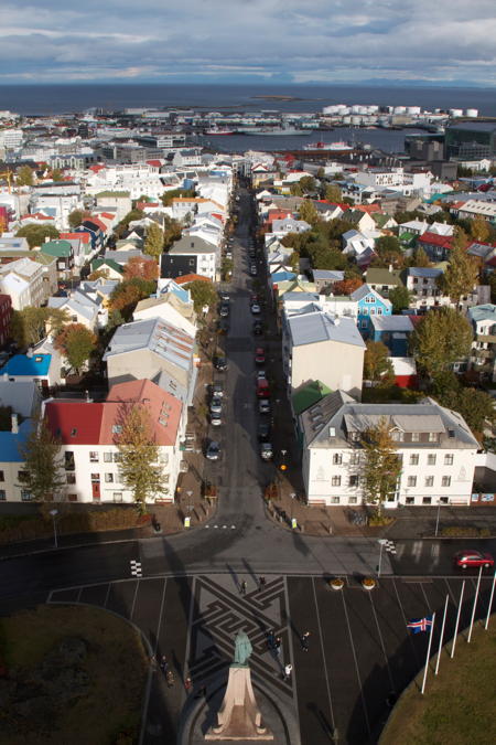
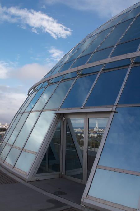
Downtown Reykjavík is conveniently small and easy to explore by foot. After just a day you start coming to streets, thinking “we’ve been here before”. So we looked at the city, the harbour, their new Harpa concert house, went up the concrete Hallgrímskirkja to enjoy the view on the city, peeked at the city hall, parliament, national library and took a short walk up a hill to Perlan a bunch of hot water tanks with a glass dome containing a cafeteria and restaurant on top.
Hot water is Iceland’s big source of energy. And there’s enough of it to heat pretty much everything to comfortable temperatures without a second thought. This leads to poorly insulated houses and quite a few buildings seeming to master everything without having chimneys. It also seems to result in a slightly sulphuric smell in the hot water, which takes some getting used to.
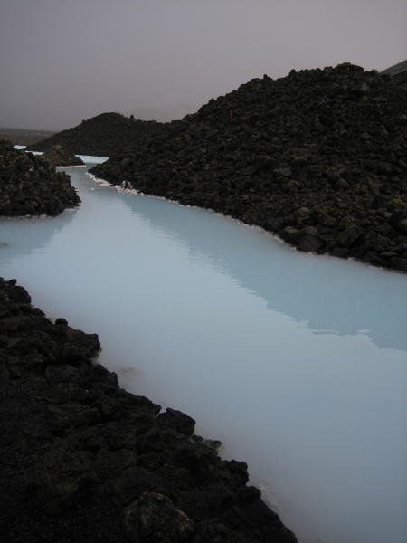
Before leaving, we indulged in a few hours of soaking in the Blue Lagoon spa which is fed by the wastewater of a power station. Luckily the power station is a geothermal one as well, so we’re just talking about a lot of hot water here – without a noticeable sulphuric smell even.
After that attraction we were dropped off at Keflavík airport again – offering a trip from your hotel to the airport with a spa-stop on the way just seems like a brilliant idea – and were comfortably tired for the flight to Toronto.
23:59
• Feedback (1+0)

