iTunes 7
5297 words on iTunes
Showtime
So there was Apple’s special ‘Showtime’ event this afternoon. It was eagerly anticipated throughout the Mac web I suppose and everybody was looking forward to finally seeing films at the iTMS. The event came and gave us new iPods – with the new iPod nano suspiciously reminding me of the wonderful iPod mini and the new iPod shuffle looking like a nice and fresh take on this simple device ( and support me with that). Great. In addition there were changes to iTMS which actually were the first thing you could see from the outside
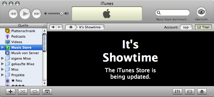
With even that announcement corroborating the suspicion that the iTunes Music store was to be re-branded as just the iTunes store. That probably makes sense, but it renders the iTMS acronym obsolete, which I’m already starting to miss. iTS just doesn’t have the same sound and is much less unique. The updated store will also sell films to you. If those films happen to be Disney’s and your credit card happens to be a US native anyway. So it’s pretty useless from my point of view.
At this stage anyway. iTMS started with pretty similar limitations in terms of both the territory and the music it covered. But over time it slowly managed to include more countries and music. I consider iTMS to still be far from perfect (what if you live in Panama, like local music and hate DRM?), but even if it isn’t good it starts being ‘good enough’ to waste the occasional Euro there.
At the end of the show, Apple apparently gave a preview of an upcoming device that will handily stream media from your computer to your telly. Strange for Apple to make such pre-announcements. But certainly something close to a no-brainer, considering how many people I’ve heard say that they’d really appreciate having something to bring their digial media to the living room without the hassle of having a computer there. Let’s hope that Apple get this right. And with all the crappy stuff you hear about problems with all those different standards in new HD media, surround sound and other things, I suspect this is a challenge from the technical point of view alone.
And in software it will be a challenge as well. As ‘Oh, pretty!’ as Front Row is these days, that prettiness wears off rather quickly. Once you’re trying to browse an iTunes library with hundreds of artists, say. Or once you try watching a film in a non-Apple approved file format, i.e. the vast majority of film files. Note to Apple: It may be crap and a rip-off or whatever, but people tend to use those AVI files, so you better be able to play them. Another thing I’ll be very curious about is how Apple will handle things like multiple sound tracks and subtitles. You usually get those when you cough up the money for a DVD and coughing up pretty much the same money for some DRM crippled file should get you those as well. Not only for us non-English speakers but also for accessibility reasons. I guess we’ll have to wait to see how all this works out. As usual I’m sceptical.
And the big news for me today is that – to accompany the film downloads (which seem to require an update to QuickTime 7.1.3) – Apple released a new version of iTunes.
iTunes 7
Unlike the iTunes 5.0.1 to iTunes 6 update which was a joke in terms of changes to the application, this update to iTunes which raises its version number from 6.0.4 to 7 seems to be more deserving of the version number jump.
Not only does the application claim to be better at supporting video playback. There are also a number of new looks and features as well as what looks like changes to iTunes’ innards to justify that jump.
Looks
 The most apparent change in iTunes 7 is that its icon looks different once more.
Most notably the notes in the icon changed their colour from green to blue – both taking us back to iTunes 2 and putting yet more blue into our Docks. In addition, the CD in the icon looks more shiny and colourful now. So much that I consider it tacky. Indeed with that extra dash of colour and the bar in the note being thicker and having a shiny reflection it doesn’t look much like a Mac icon to me but more like something you’d expect to see in a Linux or Windows UI. And that isn’t meant to be a compliment.
The most apparent change in iTunes 7 is that its icon looks different once more.
Most notably the notes in the icon changed their colour from green to blue – both taking us back to iTunes 2 and putting yet more blue into our Docks. In addition, the CD in the icon looks more shiny and colourful now. So much that I consider it tacky. Indeed with that extra dash of colour and the bar in the note being thicker and having a shiny reflection it doesn’t look much like a Mac icon to me but more like something you’d expect to see in a Linux or Windows UI. And that isn’t meant to be a compliment.
And my lack of compliments won’t end there. Actually launching the application will confront you with a question or two (see below) and then present you the glory of iTunes (click to enlarge):

Things look toned down. Most notably the checkboxes and scrollbars don’t have their native OS X look anymore but rather have a flat Linuxy grey look with a shade of blue to it. To me it just looks looks out of place on my Mac. Sure, iTunes is a multi-platform behemoth these days, but what the heck is wrong with the native Mac scrollbars? Why does iTunes have to look like a Dashboard widget? and why do the new graphics make things look like the Genre / Artist / Album browser is closer to me than the source list? I guess I’m not exactly impressed by this.
The various buttons at the bottom of iTunes’ main window look re-designed as well. They seem smaller and flatter now. Not particularly pretty in my opinion – but tolerable. UI wise I think the choice of control style is a bit strange. This control really looks like tabs in OS X. So far I thought having a set of such buttons – with all of them being stuck together means you are facing something like a tab bar or radio buttons, i.e. something where you have to make a ‘one out of many’ choice. But Apple seem to have changed their mind on that and prefer using stuck-together buttons for everything now. And thus, at the bottom left of iTunes’ window you have check-box style behaviour for stuck-together buttons, which can be individually inactive to make things more interesting. The other buttons at the bottom right are not stuck together and behave as usual ‘command’ buttons while those at the top-right of iTunes’ window are stuck together and behave in the usual radio button / tab bar style.
I thought that Apple’s programming consistency did at least mildly make sense in this area so far, but we may have to say goodbye to that as well. Just for comparison:
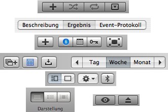
From top to bottom you see
- iTunes 7 bottom left buttons
- ScriptEditor display change ‘tabs’
- iCal buttons (note how those icons at the left are isolated while those to choose the display style are stuck together with the navigation buttons stuck to it because it ‘just makes sense’)
- Address Book display and command buttons
- left: iTunes 7 top right buttons and right: iTunes 7 bottom right buttons, both behaving like you’d expect
And while we are at those buttons, we get to discover even more UI changes. The ‘eye’ button, i.e. what used to be at the top right corner of iTunes’ window has been re-located to the bottom. I really liked the eye / burn / visualiser options button being nice, large, round and at a easily visible location of the window before, so I’m a bit sad to see it gone. On the other hand, I think it may have been a bit confusing to have such a changing button in the window and I guess this one is technically a better user interface.
An additional benefit of that re-location is that the filter field at the top of the window now is at the very left – which is just where you’d expect it to be. Just to the left of the filter field is the new button for setting iTunes’ view mode.
View Modes
This is a major new feature. iTunes had the traditional list display for many years. And it was brilliant when iTunes started off. But now, many years later, with all the music collected into iTunes and cover art having started to be pervasive it was time to go some steps further &ndash particularly to aid people with finding their favourite albums by cover art, just as they’ve done for decades.
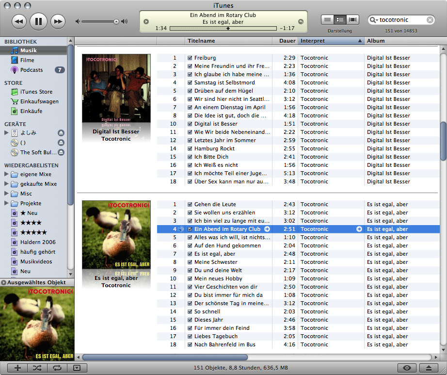
There are three view modes which are available through this new set of buttons – and it appears through this new set of buttons only. Strangely there are no corresponding items in the View menu, and thus no handy keyboard shortcuts – I’d suggest Command-1,2,3 just like in the Finder – for these new commands. The first view mode is list mode and corresponds to iTunes as we’ve known and loved it for years.
 Just that a new twist has been added: The ‘album’ column now can be sorted in several different ways. Not just up and down by album name as it used to do, but there are also modes for sorting the albums by artist and by year now. Using these new modes will significantly improve the cover based display modes (see below) and they’re a welcome addition to iTunes. However, their sheer existence is rather hard to discover. You’ll need to click in the left part of the table column now to change the sorting type and in the right part of the column to change the sort direction. That’s rather hard to discover just by looking at the UI (Thanks to Gummi for pointing this out to me.) This feature may still be a little imperfect, though. For example albums with an unknown date will appear at the beginning of the list which I find a bit counterintuitive as I’d file those ‘various’ records at the end in the real world. And reversing the sort order won’t help much on that either as that will also reverse the order of songs in the albums. Yet, it’s an interesting starting point.
The next one is what I’d call album mode where songs are grouped as albums and displayed along with their cover art. While this may not be particularly useful when browsing the whole library – which may contain single non-album songs that spoil this view – it’s excellent to go through your albums by specific bands:
It’s all shiny and nice. And I’d say it’s not quite perfect yet. For example I find it a bit irritating that compilation CDs including a single song by a band are listed just between the regular albums. Of course I see how this is in line with iTunes’ traditional way of displaying things, but I don’t think it’s particularly useful in this case.
Similary, displaying a whole album for each song that doesn’t have its album information set is wasting a lot of space. Again, I can see how each of these songs could have distinct cover are. But glancing across my music library suggests that many of those stray songs are stuff like demo downloads from the artists’ websites which don’t have cover art to begin with. And even if they had, that cover art wouldn’t mean too much. In any case, iTunes is wasting a lot of screen space here and alternate solutions such as generating a ‘mosaic’ style cover art for all the tracks whose album is unknown may be superior.
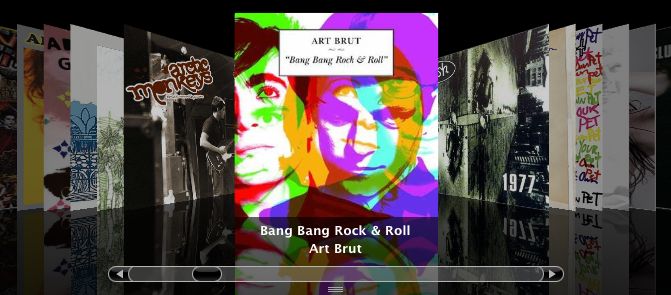
Talking about cover art, things get even better as iTunes’ third view mode is Cover Flow mode. From a technical point of view it looks like Apple did the ‘right thing’ for a change: they simply bought the technology of the much beloved iTunes tool rather than re-implementing it in a shinier way themselves.
Cover Flow’s 3D view of your album covers sliding by is as sweet as it used to be. It goes with the playing song in iTunes but updates the view to reflect the current selection while you are browsing around your library. The view will revert to the currently played song a few seconds after you stopped browsing. What it find quite irritating is the usual left and right arrow key presses will not do the usual back / forward action in your current playlist but browse around your album covers instead. Sure, the official keyboard equivalents for going back and forward seem to be Command- left and right these days, but I have yet to meet someone who is even aware of that fact.
And just as for the album cover view mode, Cover Flow mode really suffers from the covers of compilation CDs coming up everywhere (when sorting your library by artist anyway, it’s worth playing with the new sort options for albums when using this!) and from all those unknown albums without cover art given loads of ‘empty’ covers in the flow.
Album Covers
Of course having album covers is essential for the new display modes to really shine. And making sure to grab album cover art from band websites or amazon has been a big time waster for most iTunes aficionados (or their utility programs) ever since iTunes started including its rather nice feature for displaying cover art and using the album covers to compile nice printable cover art for your burned playists – aka compilation CDs.
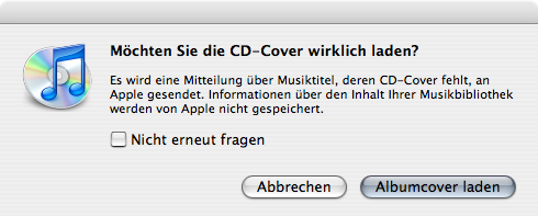
Luckily Apple finally gave in on this point and iTunes 7 includes a new feature to load cover art (presumably from the iTunes Music Store) right from the internet. As far as I can tell you can request cover art on a per song basis by using the or by using the contextual menu. iTunes also has the option to automatically download cover art for CDs you insert. To me this looks like it manages to strike a good balance between good service for people who buy and import their CDs and still acceptable service for everybody else.
iTunes seems to store cover art inside the folder ‘Album Artwork’ inside its ‘iTunes’ folder. In there you’ll find a folder ‘Downloads’ and a folder ‘Local’. With the latter presumably just being a cache from the images found inside your song files. It’s not quite clear where all this is going yet, particularly as the iTunes server seems to be very hard to reach currently and I couldn’t really play around with this. Is ‘the future’ in storing cover art centrally rather than on a ‘per file’ basis? While it isn’t terribly efficient, I’ve always liked iTunes way of having cover art in each file, as it means that you can fully spread the joy when passing on a single song to a friend and that all your cover art will remain intact even when you decide to remove your music files from the reign of iTunes.
A final point I liked about this is that iTunes is nice and explicit about telling you that asking for cover art means that Apple servers will be contacted and by promising you that they won’t store personal data (strangely you still need an iTMS account to download cover art at all, though). Perhaps they learned a bit from the desaster they had with the ‘Mini Store’ some releases ago.
Tidbit: It looked like iTunes contacts an URL like
http://213.248.112.115/WebObjects/MZSearch.woa/wa/coverArtMatch?an=Arvo%20Pärt&gn=Classical&pn=Tabula%20Rasato get the cover art, just in case people want to play around with that.
Source List
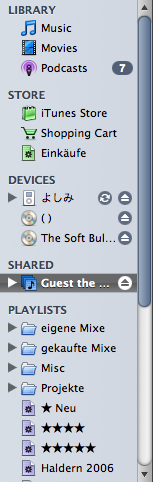
Another major change in iTunes 7’s user interface is the re-design of its source list. It’s yet another type of source list that is completely different from anything else on the Mac. Not only does it come with a colour scheme matching those new scroll bars mentioned above, it also comes with a completely new structure.
 The structure is given by little titles in all capital letters that are inserted between the different groups of objects in the source list. So instead of having a single line used by the
 Music Store, there is now a line reading ‘Store’ and it contains an item ‘iTunes Store’, an item ‘Shopping Cart’ and and item for bought items (which unlike the others can be renamed). It also potentially has an item for current downloads appearing there. All I can say to this is ‘Thank you very much’ – as in ‘No Thanks’. The previous version of having a single item for the store which could be opened to reveal its contents was just fine.
Similarly for shared libraries: As soon as a shared library becomes available on the network, you’ll get a label ‘Shared’ and see that library below it. Much less efficient than the traditional approach of just listing the shared library when it’s there and only adding the extra level of hierarchy when there actually are two shared libraries or more.
Amd for CDs we have the same thing again. Just that we have to think of a CD as a ‘Device’ now, so it can be listed in the same group as your iPod. To me this just doesn’t make any sense. Which of course doesn’t matter. But I also think this reeks of the badness that is the user interface in the Windows. It forces an overly technical and completely unnecessary structure on you which doesn’t really help.
The only part where the extra separation might be useful is the more stringent distinction between the various data types in the library. Now all the movies and TV shows and Music and podcasts can be easily separated. Huh, they could also be in previous iTunes versions? Ah well… And to let me add that they even removed the ability to rename my Music Library to ‘Plattenschrank’ that I so enjoyed in previous iTunes versions.
Even worse, the new artificial split up just gives absurd locations for some items in the source list. Want to transcode a file from one format to another? Then go and watch the transcoding process. Where? Ah, of course in the playlist section of the source list. Not that iTunes will let you play any of the items in the list, but hey… Similarly, trying to watch the download of the latest podcasts? Well don’t expect that to be visible with your podcasts. Of course the store section of the source list is where you want to look for that information. Before those little headings were introduced the order may have been the same. But at least it didn’t look absurd.
I am tempted to say that all this extra structure hurts more than it helps, because it wastes numerous pixels of precious vertical screen real estate. And wasting vertical screen real estate is what the designers of that source list invested all their verve in. Not only are those different ‘categories’ of items separated by additional space also the vertical spacing of the items has been increased by about three pixels per line.
Add to that that some of the icons seem to have changed (smart playlist seems to have moved from easily recognisable gear wheel icon to a blurry mess for example). In addition they didn’t make things freely reorderable within its ‘part’ of the source list, but the ordering is still pre-determined by an item’s type and name. In total I find it really hard to be positive about this in any way. The only good thing probably is that it’s now easy to turn off any item of the source list you don’t like or use in the first tab of the preferences. But that doesn’t have much to do with the source list itself…
Finally I have to remark that this new source list design seriously looks like it has been ‘inspired’ by the reeking hell that is Windows. That artificial and overly technical way to structure things which were perfectly understandable before just so they look ‘more organised’.
Gapless
Fortunately Apple’s engineers also did some work in iTunes’ intestines. For ages it has been a problem to rip MP3 files so they play without any gaps between them if the music didn’t fade to total quiet at the end of one track. So far, iTunes’ way of dealing with this has been the ‘Join Tracks’ feature that simply ripped several tracks from the CD into a single MP3 file. For various reasons doing that just isn’t great. For example it makes it hard to skip to a specific song in your ripped Sigur Rós CDs.
While people said that this phenomenon is inherent to the MP3 (and apparently also AAC) file format, it seems like Apple decided to solve that problem nonetheless. I have no idea what exactly they are doing, but after iTunes goes through all the library to collect some data from the song files for that purpose (be prepared for a long wait and plenty of disk activity during which iTunes is untypically unresponsive), you can designate each song to be part of a gapless album. And my first tests suggests that this actually works.

So, hooray!
Info Window
The information window for each song also saw an addition with this version of iTunes. Namely that of a check box for the ‘gapless’ feature. So far so good. But unlike in previous iTunes updates, this time the programmers did the job properly and added that option to the batch information change window (which you get when selecting several files and opening the info window) as well. Indeed they also added all the other options which have been painfully missed from the batch window for years now. Which means that we finally can use iTunes’ graphical interface rather than having to refute to using AppleScript to batch change these attributes.
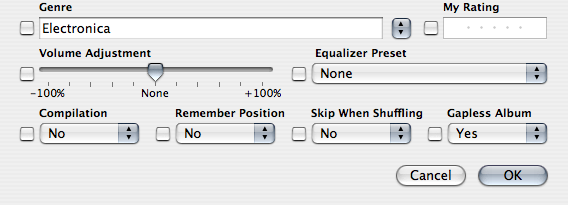
Fun bit of trivia: In the German UI things are a bit uglier as that bottom line of popup menus had to be extended to two lines. At least they did proper localisation here…
AppleScript
Talking of AppleScript, iTunes 7 seems to also support all the new fields it knows via AppleScript. I kind of suspected this after seeing the improved batch information window, but after cockups in this area in previous releases I thought I’d have a look anyway…
iPod
Of course the iPod remains a big raison d’être for iTunes. And we are seeing some iPod related changes in this update as well. To begin with, the somewhat confusing iPod preference pane in iTunes’ preferences is gone for good now. Instead we are presented with the various options for the attached device in iTunes’ main view on selecting the iPod in the source list.
The style of this is strange once more, looking like KDE or Windows rather than a Mac but at least we can easily see the remaining capacity and make all the relevant settings there without needing to take a round trip to the preferences. I assume that the fact that both the serial number, the firmware version and file system type are displayed in plain view may be to make work easier for Apple’s phone support people.
While I welcome the easier access to iPod settings and am happy to not need external iPod updaters anymore but do everything from within iTunes, I find the GUI for it questionable once more. (Amusingly that GUI seems to come from a nib file – the first instance of such ‘modern’ technology in iTunes, and it’s working on Windows as well!) It just looks out of place. Also, having ‘Cancel’ and ‘Apply’ buttons for preferences seems so 20th century and becomes very obvious once you move certain preferences out of their modal window.
A nice change I saw while synching the iPod is the following: When iTunes cannot locate a song’s file (and strangely a number of my song files seem to have vanished … scary!) it used to display a window stating the song’s name and sporting an OK button. So far so good – unless you have more than one song with that problem. Then you’ll know about that one, try to find it again and re-insert it into the library. And you’ll have to wait until the next time you sync your iPod to discover the next song with that kind of problem. Well, iTunes 7 improved this situation! It actually displays a list of all the songs it can’t find in one go. Better than its predecessor for sure. But still not as useful as a resizable non-modal window would be for this.

And just to be nitpicky… if all the software and all the hardware are ‘crafted’ by the same company which forces you to update your software for any new hardware that is released anyway – if all those points are given, is it asking too much that the graphic displayed for my iPod actually matches the iPod’s look? Early versions of iTunes had that nice touch and it looks like iTunes 7 does contain the relevant graphics as well but isn’t good enough to see which kind of iPod it’s talking to.
Backup
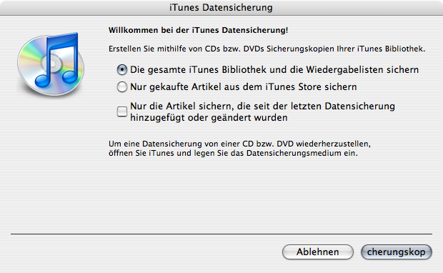
Another new feature is backup related: In iTunes 7 there’s a ‘Back Up To Disc…’ menu item in the file menu. It gives you options to make a backup of all your songs, of just your Music Store purchases or of the changes since your last backup. Allegedly inserting the burned disc with the backup will be sufficient to restore the data.
I haven’t tried that feature yet. But I really hope it works well and successfully restores all the iTunes internal metadata along with the files correctly. It’s great to see that Apple starts seeing that data security is an issue and that software should offer to help people keeping their data safe with minimum effort. I’ll be keen to read about people’s experiences with this.
Localisation
Unfortunately the German version of the backup window strongly suggests that no human even bothered to look at it before shipping this version of iTunes. I wouldn’t consider this to be well-localised software. And while I guess it’s a problem that will be ironed out in some subsequent update, I hope that implementing the technical side of the backup has been done with more care.
Similarly some of the words you see in other parts of iTunes’ user interface just seem usual (at best, incomprehensible may be a more apporpriate word). For example, preferences item to set the font size for the song list – which even used to have a reasonable translation in previous versions of iTunes – is now labeled Liedtext
which sounds more like it’s about lyrics than about the list. Even less amusingly the same preference still seems to be labeled correctly in the Windows version of iTunes. Which – uh – suggests that the versions aren’t as identical as I assumed them to be and that after just a few years we start getting the worse deal on the Mac side of things.
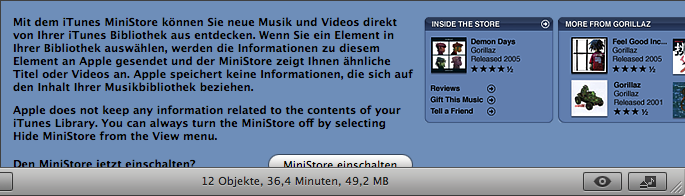
The MiniStore may also turn out to be an embarrassment once again. In its German version it displays a strange mix of German and English text which doesn’t fit into the space that’s reserved for it – thus making it impossible to see the user interface compeletely here (and that’s even worse in the Windows version where you can’t even guess what’s written in the button). – The joy of using non-fixed UI techniques (HTML?) meeting non-existant testing I suppose. Of course it will go wrong.
And, embarrassingly, iTunes 7 still has the problem that its non-English localisations do not recognise ‘The’ at the beginning of a band name as a word that is to be ignored when sorting. Apple had this working right in the late versions of iTunes 4 and broke it again in iTunes 5. I just don’t get this.
Luckily this problem – which also spoils the music sorting on your iPod – can be fixed with a text editor and a few clicks. The ‘patch’ I described for this last year still works for iTunes 7.
It may also be interesting to note that iTunes 7 contains a Russian localisation now. Perhaps a hint for future territories to be conquered by iTunes and its store.
Patching
Along with the artist sorting, I used to improve iTunes’ looks by dimming those little clickable arrows a little so they are less distracting. Luckily the patch for that isn’t really needed anymore as Apple chose a more subtle way of displaying those arrows now: They are only displayed for selected songs and the currently playing one.
The upside of that is a cleaner look. A downside, however, exists as well. As the arrows aren’t visible before you select an item, you cannot click them either. Thus, navigating around your iTunes library with those arrows (don’t forget the defaults write com.apple.iTunes invertStoreLinks -bool YES trick!) may require some extra clicks now.
Video
With iTMS being rebranded as just the iTunes store and actual films starting to be offered, iTunes is starting to take a more serious position as a video player. Having in mind that video playback in iTunes simply sucked so far – it being probably the most reliable way to play a video in a jerky way on the Mac, the question is to which extent these problems have been fixed.
And while iTunes’ video window now comes with a fade-in HUD for controlling the playback, I am afraid the video playback capabilities are still far from the smoothness offered by QuickTime Player or VLC. Some extra work will have to go in there to make watching those dearly payed video files an enjoyable thing to do.
And if Apple are serious about doing the video thing, they may want to reconsider iTunes’ refusal to manage Avi files that QuickTime (and even iPhoto) will handle just well. And once they’ve done that what about the ‘challenge’ of putting iTunes in a higher gear to make ripping DVDs just as simple as they made ripping CDs. After all – those video iPods want to be filled.
Final Notes
While I tried to cover many areas here, I’m sure still have missed a point or three. Other things that may be worth noting are:
- The new ‘Store’ menu collecting all the commands relevant to the iTunes Store. This also nicely consolidates the DRM relevant menu items (except for the Audible one, which is a bit strange).
- The visualiser size settings being hidden in the preferences now and the Visualiser commands being somewhat streamlined into the View menu.
- The need for the iTunes database to be updated at the first launch, presumably to accomodate things like the gapless playback.
- iTunes now displaying an ‘Opening iTunes Library’ window when launching, which makes the startup seem longer than it used to.
- Scrolling feeling a bit smoother. And perhaps the filter field being a bit smarter now as well – letting you type several letters before updating the display. At least filtering feels less instantaneous but smoother now.
- An option to turn off the display of the ‘content ratings’ in my library.
- iTunes counting how frequently you skipped a song in your library (information that doesn’t seem to be displayed in the info window but which you can display as a column in the song list). Something which can possibly be quite useful when making smart playlists for filling the iPod. Also something which gives strangely reading menu items in German:
Anzahl der Übersprünge zurücksetzen
huh? - The File menu now contains a menu item that lets you recover your bought songs from your iPod (at least that’s how I interpret its name)
- There’s a checkbox for ‘CD Text’ now in the Burning preferences.
Any more observations? Drop a line! Or just lean back and enjoy the music…


