Text Rendering
623 words on Software
When Safari for Windows was released many people suddenly started thinking about font rendering because Apple decided to let Safari render fonts Mac style. This made Windows users scream OMG, blurry!
and it made Mac users look down on Windows users and their lack of taste. Of course our respective habits have to do with this. Looking at fonts that are rendered in an un-common way will look bad at first sight.
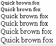
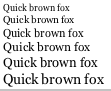
Joel Spolsky gives a good side-by-side comparison and points us to different philosophies in font rendering which make Apple try to preserve the font shape and spacing as well as possible. Another difference that usually strikes me is that text just looks too thin in Windows. And people at Apple seem to have thought he same.
While Microsoft decided to use thin and narrow fonts like Arial or Tahoma for their user interfaces, Apple have always used thicker fonts like Chicago, Charcoal or Lucida Grande. None of them has vertical lines which are drawn with a single pixel in their standard UI size. And Apple decided that this concept was good enough to also use it on their iPods. [Just the iPhone seems to be using Helvetica as its main font – but it has a rather high resolution display which again makes those verticals a bit thicker and may open the era in which displays are good enough for thinner fonts.]


And if you start with such a philosophy for your on-screen fonts, it’s perhaps just natural to choose an algorithm for font rendering that results in slightly thicker characters. Just as it seems more natural on Windows to have the slightly thinner characters.

Now you go and decide which of the on screen texts looks more like the printed version on paper. Pick your poison (while I’ll just spread a bit of hate towards German bureaucracy who seem to have degenerated enough to use Arial on their forms…).
And which of these do you like best?
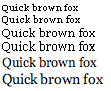
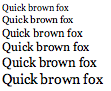
Just asking…
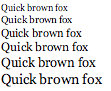
To finish let me just be a complete Mac zealot and highlight how fun taking the Windows screenshots was here. The anti-aliasing options in Windows can be reached in the simple way of using the contextual menu on the desktop background, choosing Properties there, then Appearance and then Effects. As, obviously anti-aliasing is just an effect (now what does that tell us about Windows’ font handling?). To be en par with the Mac’s font display I also had to set Windows’ resolution to 72dpi instead of the common 96dpi. Again, reached through the Desktop properties, then Settings, then Advanced and then General and then suggesting a restart before my screen was filled with unreadably small type. But I fought that and this really did result in 11pt type having the same on-screen size as it has on the Mac.

As much as I bitch about Apple’s software and its faults, I think regularly using Windows would just make me scream constantly.
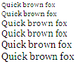
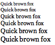
Finally, a side-by-side comparison of Safari and Safari for Windows displaying the same simple page. Their display is pretty much the same with the exception of the smallest size. [Technically, we have Safari 3.0.2beta for both systems here with Medium anti-aliasing, 72dpi, and the setup to not use fonts smaller than 9 points – a number that obviously is interpreted differently in both versions but cannot be set lower than 9 in Windows. (Screen resolution handling is a somewhat dubious topic in Apple’s hands, traditionally.) Zooming in on the image will show you how the anti-aliasing really is the same pixel-by-pixel (just the rgb values seem to be off by one which I am tempted to blame on a combination of Parallels and colour management)]

